 Image 1 of 5
 Image 2 of 5
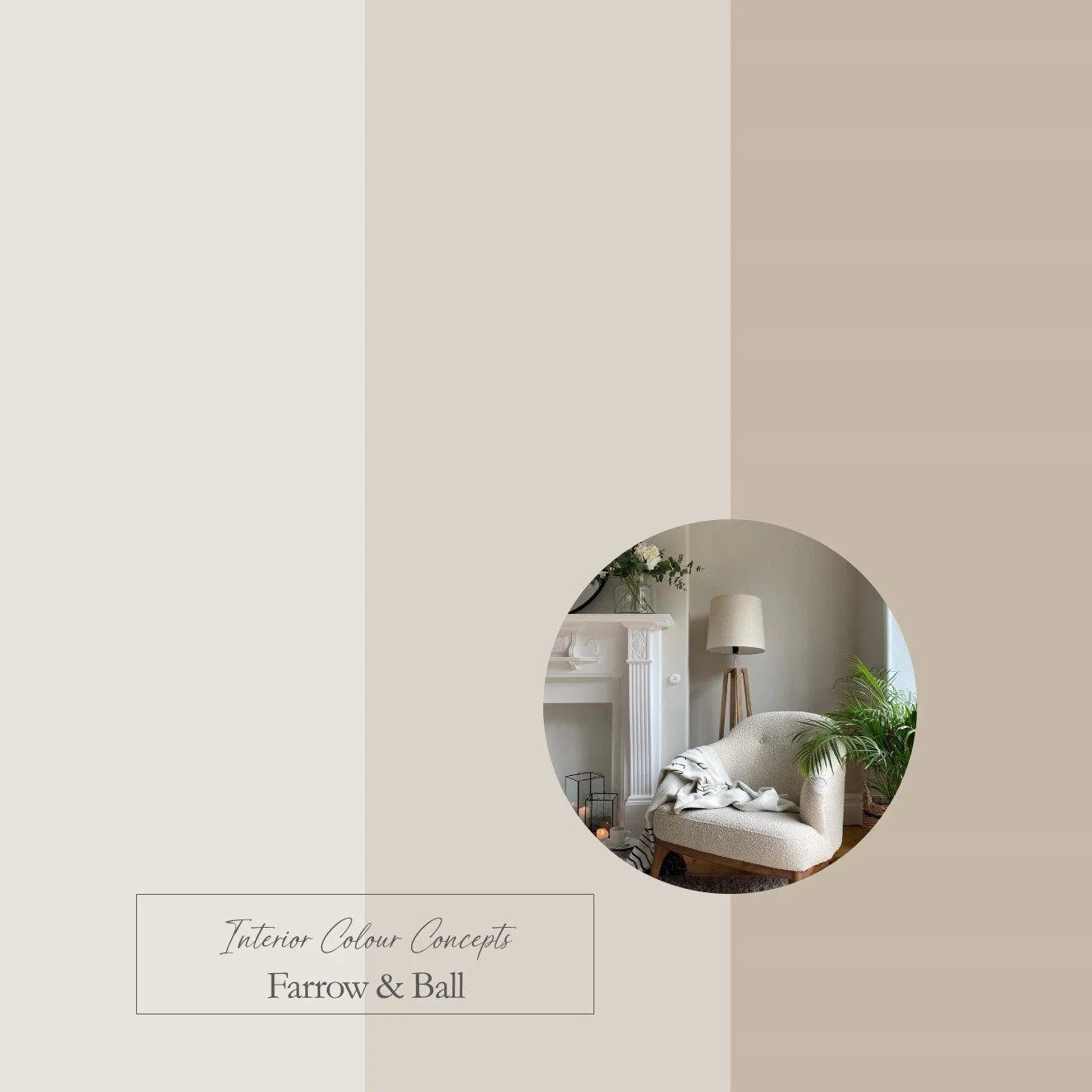 Image 3 of 5
 Image 4 of 5
 Image 5 of 5
Taking inspiration from nature, our carefully curated collection of ten paint colour schemes includes enduring favourites from Farrow & Ball and Little Greene. We aim to help you visualise colour pairings by displaying nine coordinating colours together in a palette. These colour boards will help you "zoom in" on the combinations you are naturally drawn to, and understand which paints work well together. They are an invaluable guide when making difficult colour choices for your home.
Our Contemporary Neutral Palette features a selection of warm greys from Farrow & Ball and Little Greene. These colours are not cool, blue-greys; they are light, versatile and earthy. They are perfect for north-facing rooms or as a backdrop to a relaxed monochrome scheme. This combination of colours is enduringly popular in the UK as they work very well with our Northern Hemisphere light, particularly in the winter months. Many of these tones have red, lilac or brown undertones, creating an enveloping atmosphere in low lighting conditions.
This is a digital product that will be sent to you as a PDF immediately after payment. The document will include 3 colour boards showing the names of all the paints featured in these palettes. The paint swatches should be viewed from left to right:
- Neutrals for walls, ceilings or woodwork
- A mid-tone colour for walls
- A darker accent colour for feature walls, painted furniture or soft furnishings