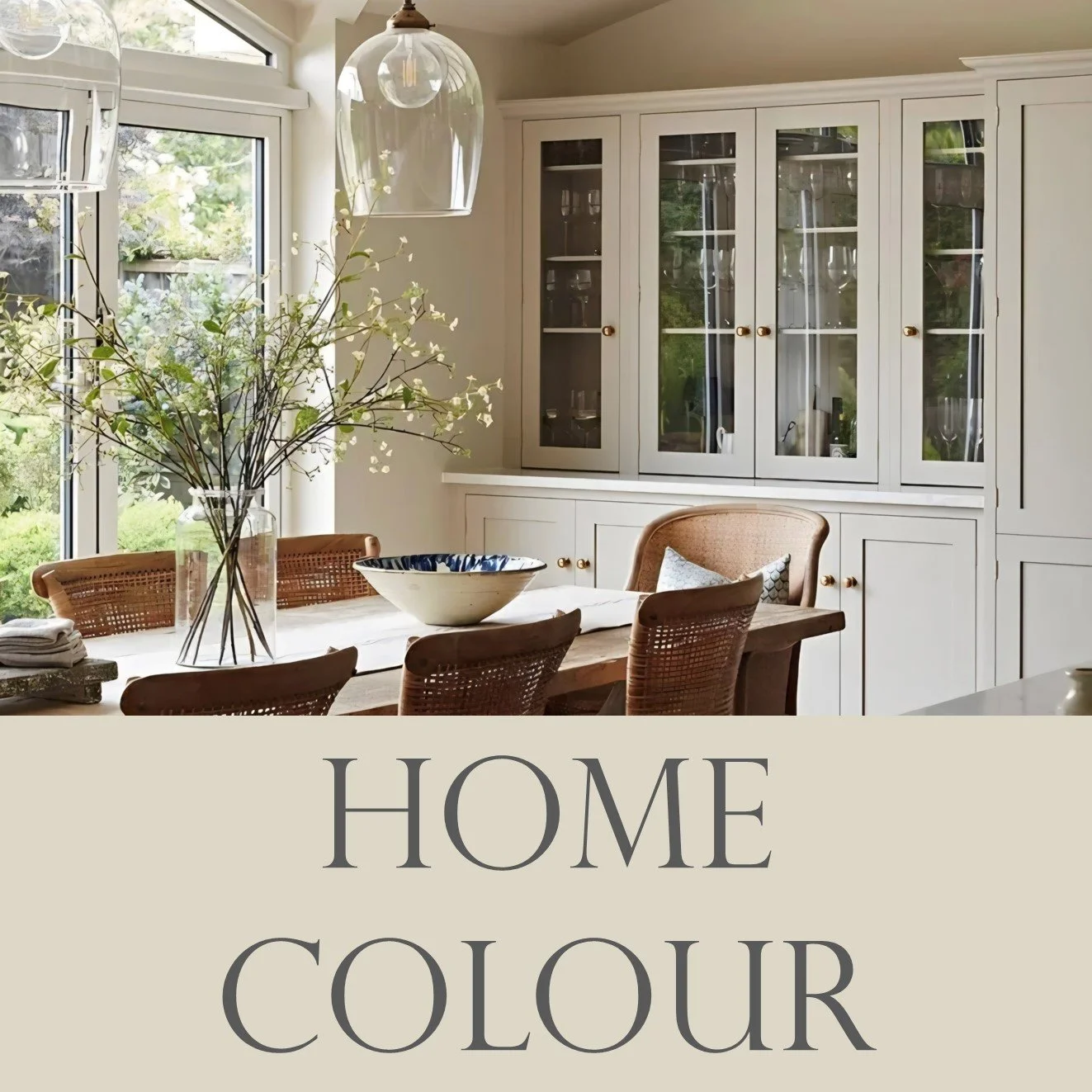
Colour Design For Everyday Living
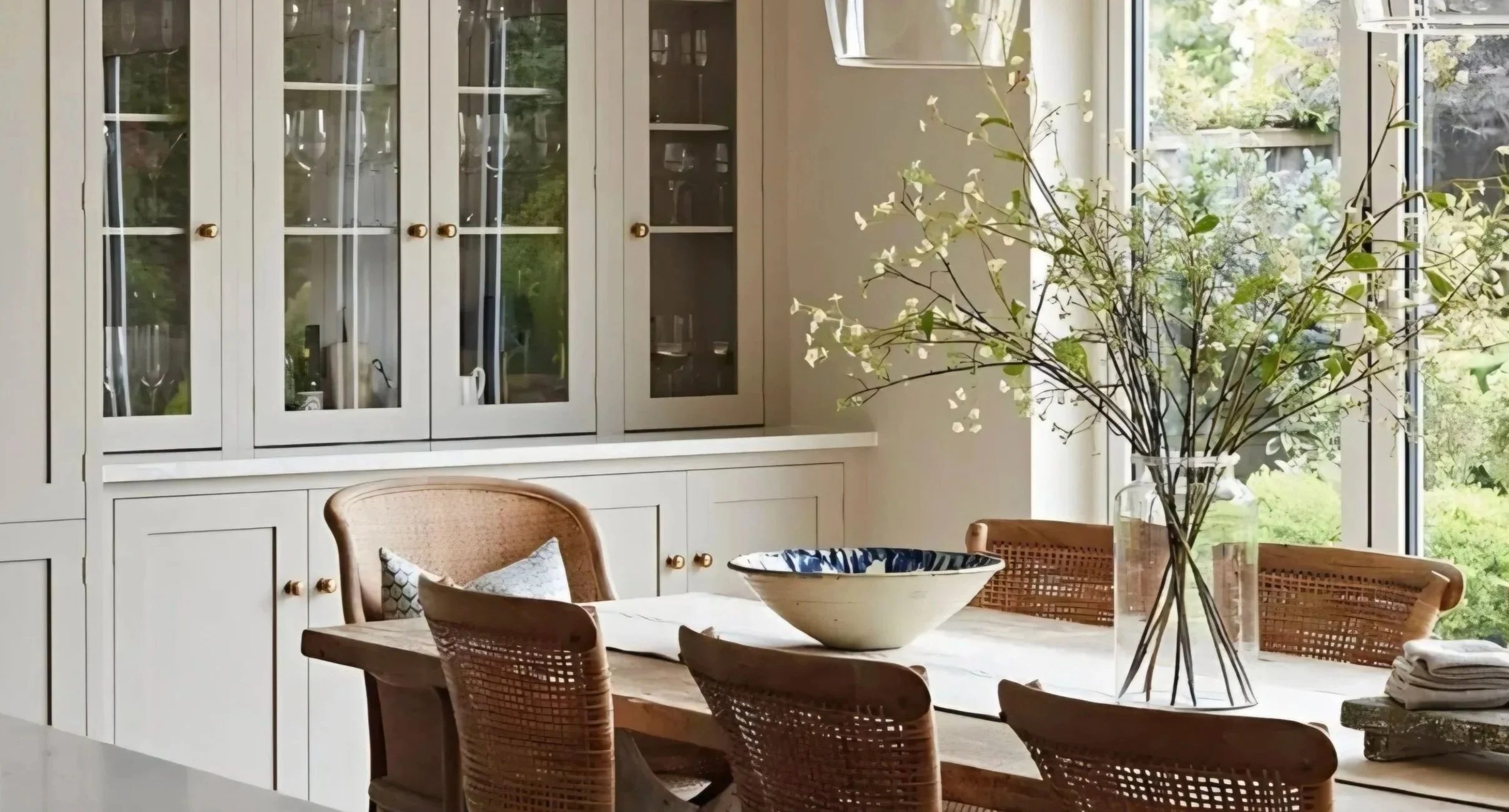
Units painted Shadow White F&B @ivy_laneinteriors
Create an authentic home with our original designs balancing colour and personality.
At Interior Colour Concepts, we believe in the transformative power of colour. Colours excite and inspire us, but choosing them can be challenging. We make it easy by narrowing your colour choices down to a few select combinations. Our user-friendly colour palettes are designed to suit your home, saving you time and money. Take a look at what we have to offer, and please get in touch if you have any questions.
Featured Products
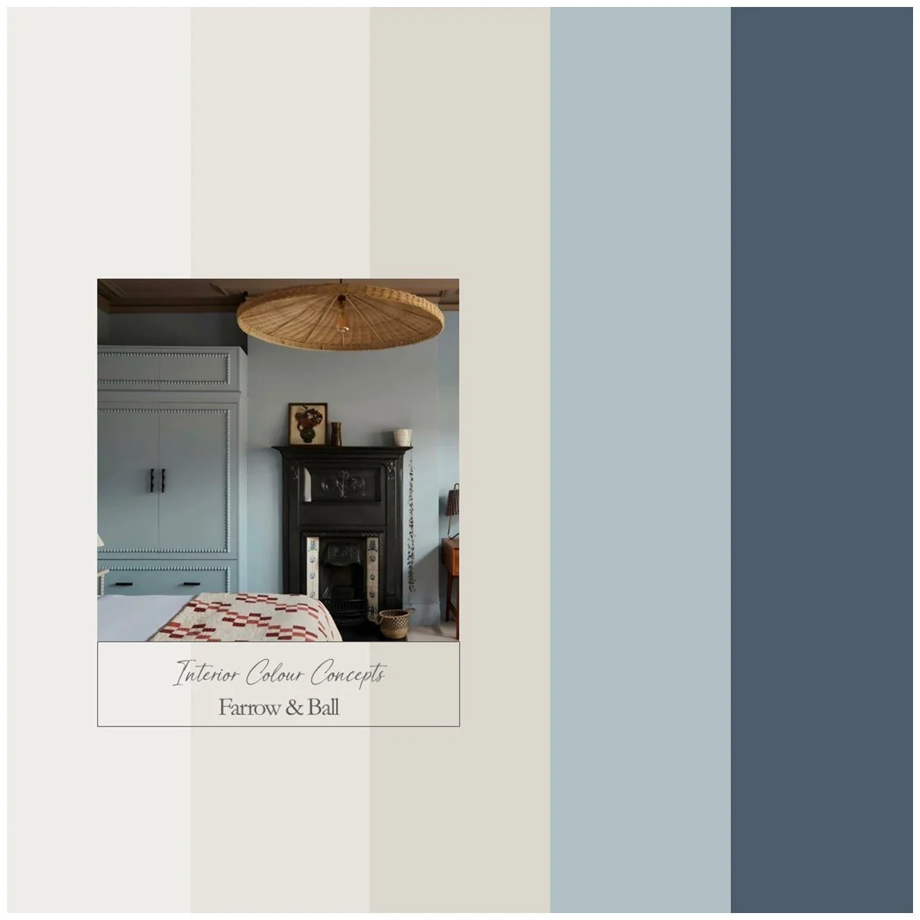
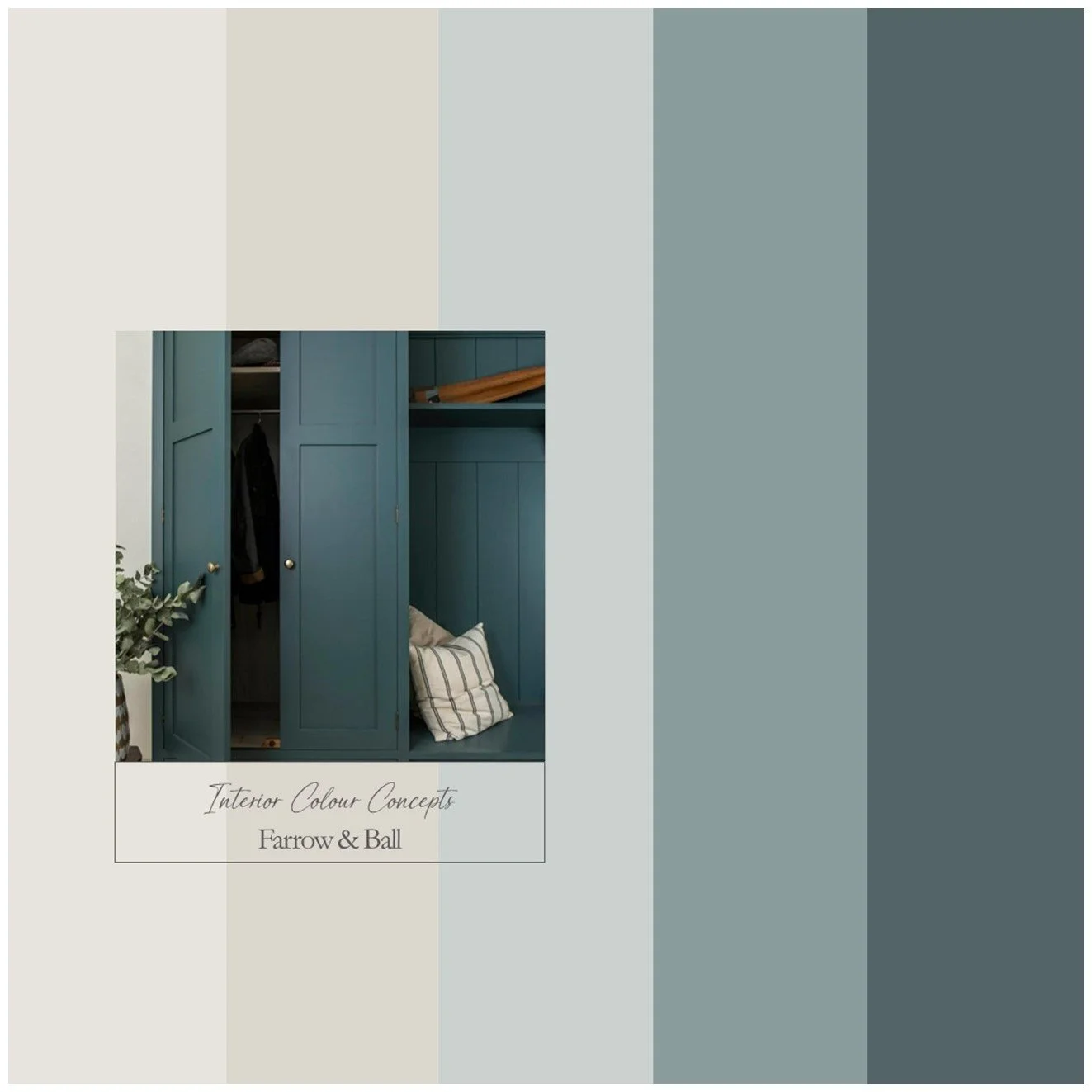
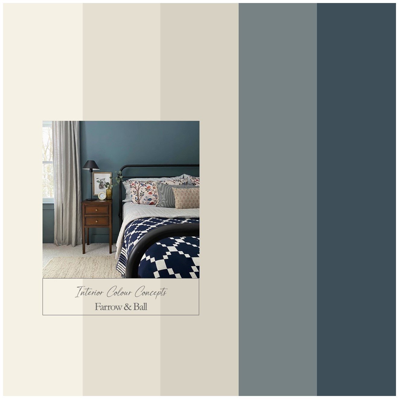
A harmonious collection of blues, greens and neutrals designed as a colour palette for your entire home.
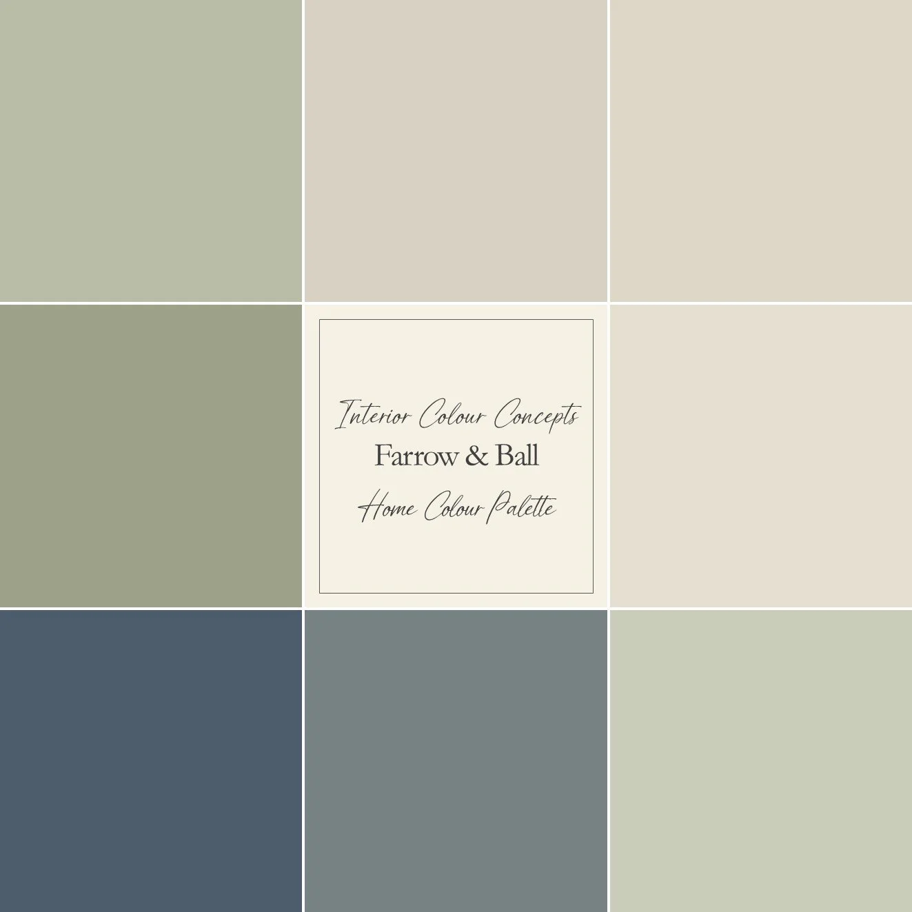
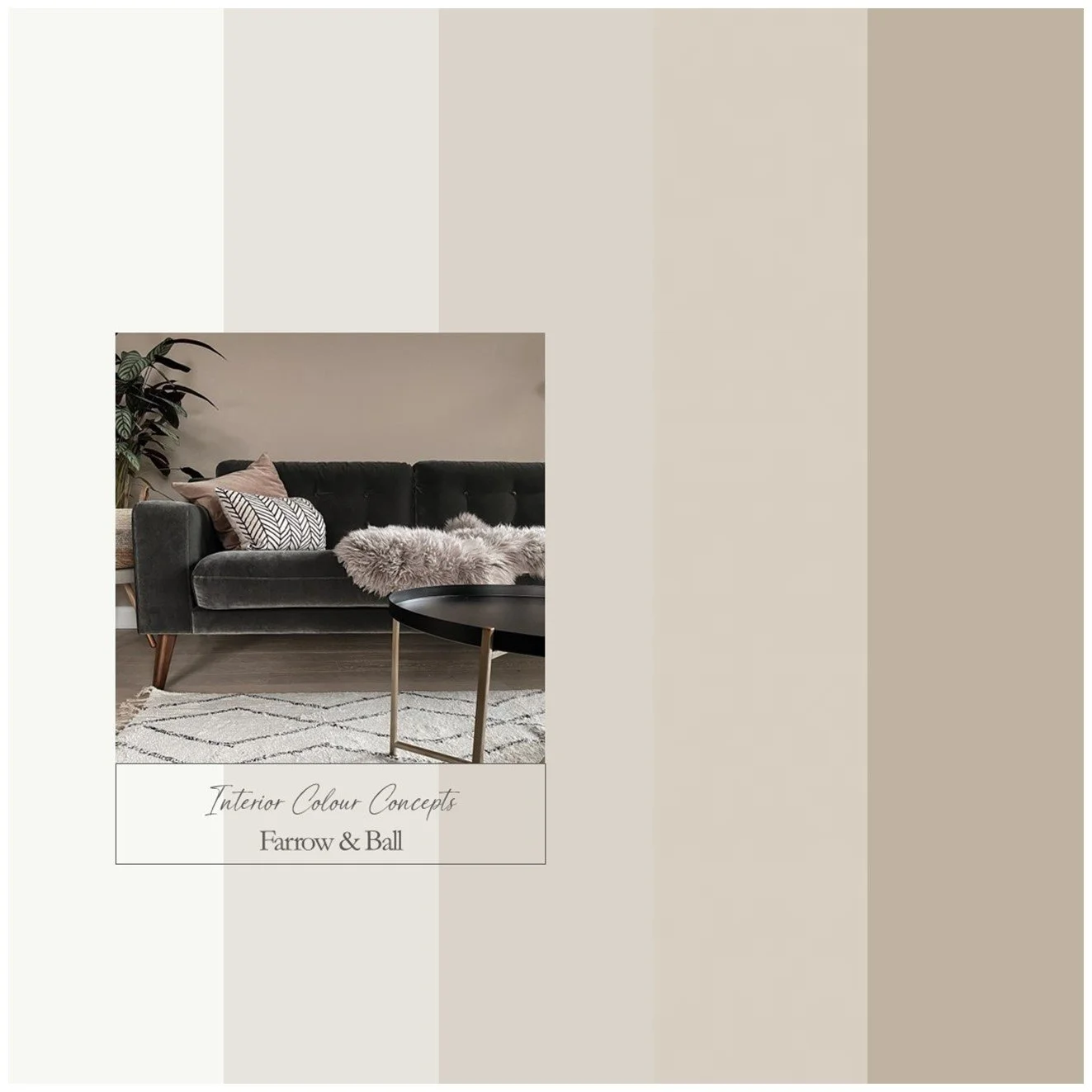
In this section, you can purchase a colour palette to be used throughout your home, in various rooms. This detailed guide helps to ensure continuity and flow, particularly with neutral paint colours. You will receive information on all nine colours recommended in the scheme, along with four suggestions for combinations that could work in specific rooms, as well as explanatory notes.
This colour scheme is similar to our number 3 board, using the same neutrals but with less muted greens and blues for a slightly brighter, more vibrant look. Spaces that promote stability and harmony can be created using blues and greens – that is why these combinations work so well in a home environment. These colour palettes can help you create a sense of balance and cohesion in your home. Images from @oakdesignproject, @the_indigo_house and @farrowandball.
Our advice is to always check your colour choice first on your Farrow & Ball or Little Greene colour card and then with a sample pot. Colours can look different depending on the aspect of your room and the lighting. Paint your sample onto a large piece of card or the back of a piece of wallpaper. Apply one coat, leave it to dry, then apply another to achieve an accurate representation of the colour. Move your painted paper sample around the room and tack it to different walls. Look at the colour in different lighting conditions and at different times of the day.
We kindly ask that you do not share any details of the colours on social media. We are a small company and would prefer to keep our colour boards within our domain whilst sharing them with you.
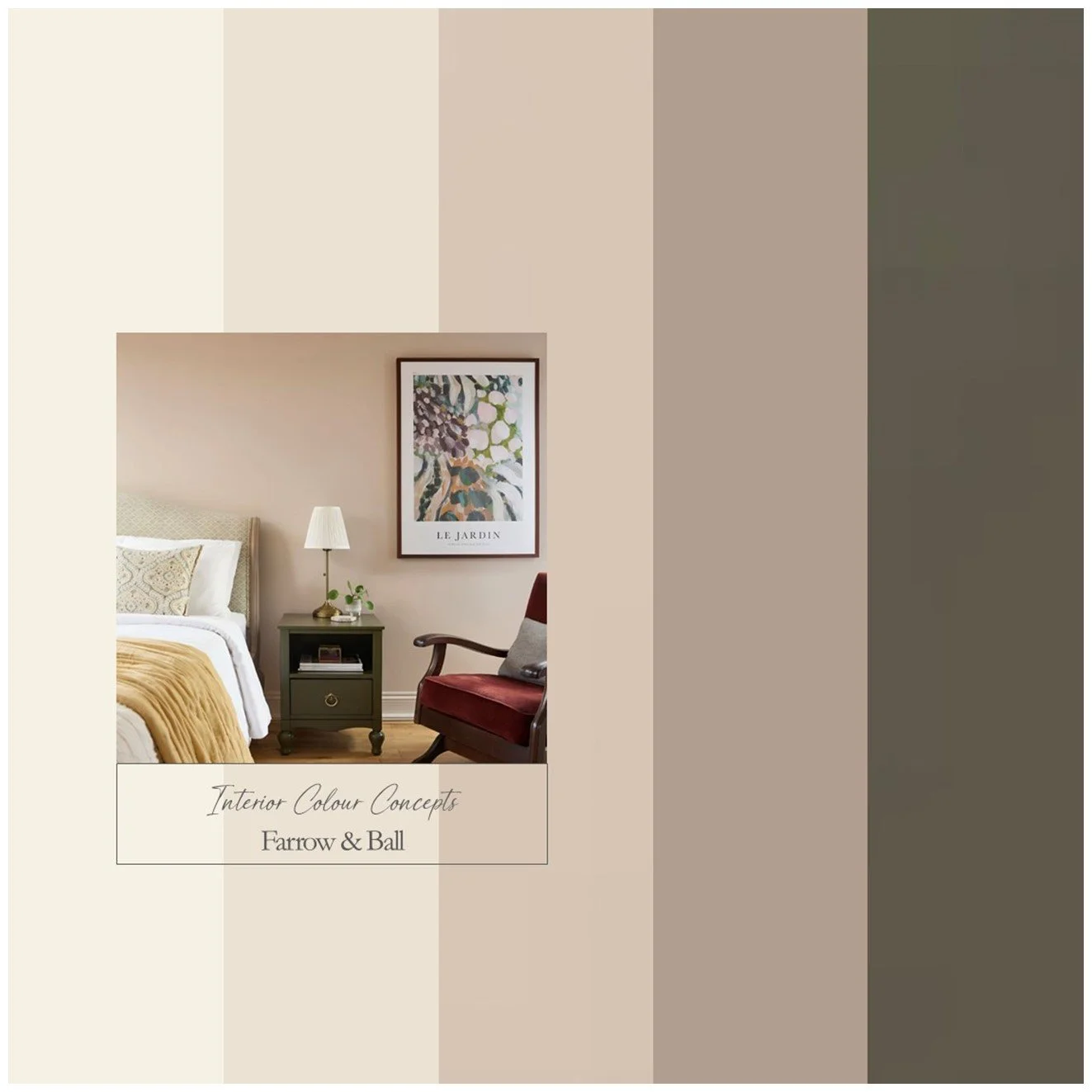
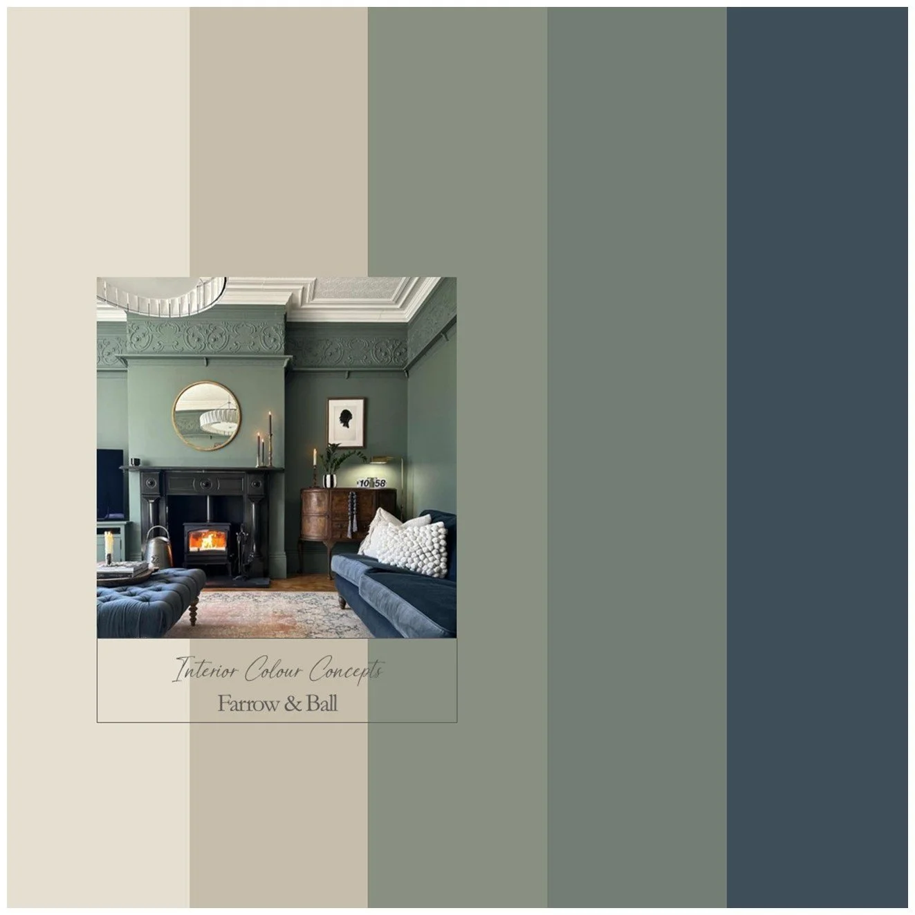
This balanced palette of blues and warm neutrals is perfect for adding character to an interior scheme.
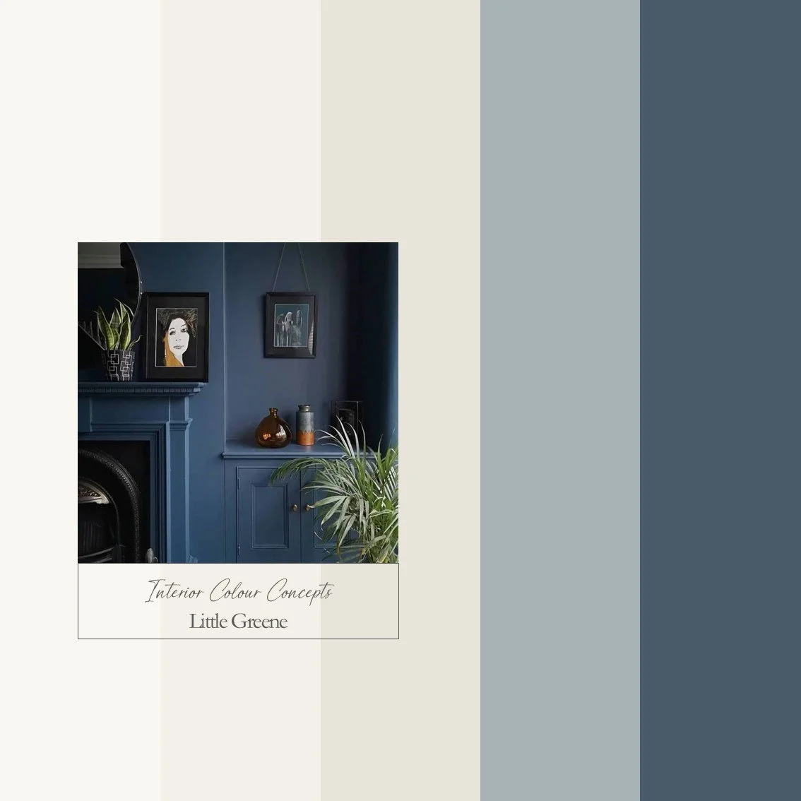
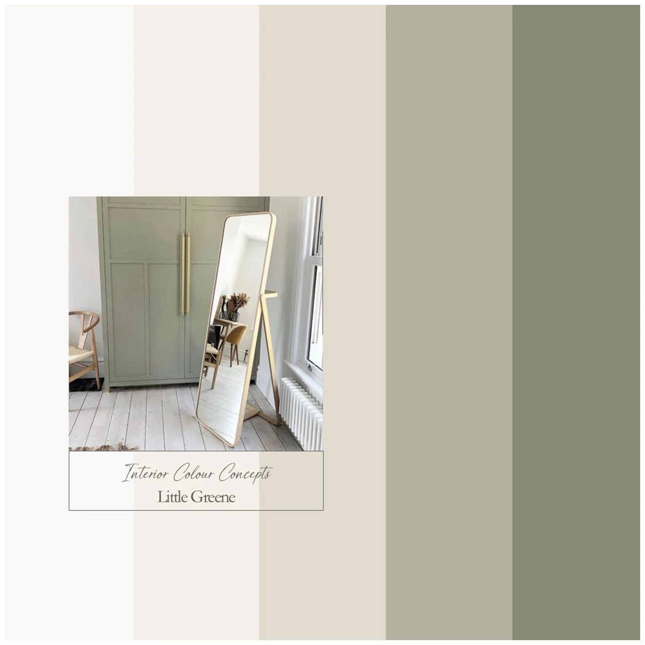
This is a classic palette of Little Greene blues, warm neutrals and off-white. The mid-tone blue is unique because, despite its subtle grey undertones, it feels warm and avoids the coolness of brighter blues, creating a calm, cosy atmosphere. Use it alongside the darker navy blue and the warm neutrals for a timeless, stylish look. This palette would suit a kitchen, bathroom, restful bedroom or living room. Images from @littlegreene.
Our advice is - always check your colour choice, firstly on your Farrow & Ball or Little Greene colour card, and then with a sample pot. Colours can look different, depending on the aspect of your room and various lighting situations. Paint your sample pot onto a large piece of card, or on the back of a wallpaper cut off. Paint one coat, let it dry, then paint another - you will then have a true representation of the colour. Move your paper paint sample around the room, tack it to different walls, look at the colour in different lighting conditions and at different times of the day.
We also kindly ask you not to share any details of the colours on Social Media - we are a small company and would like to keep our Colour Boards within our domain - whilst sharing them with you!
Whether you want to add a splash of colour to a neutral room or create an eye-catching feature wall, our diverse range has something for everyone. Our boards are updated regularly, with new colours and combinations appearing on our competitively priced boards, which range in price from £5 to £20.
Unlock your home's full potential with Interior Colour Concepts. Browse our eclectic range of colour schemes and download our professional colour boards featuring Farrow & Ball and Little Greene paints.
Best Sellers
Explore our best-loved palettes.
Product Categories
-
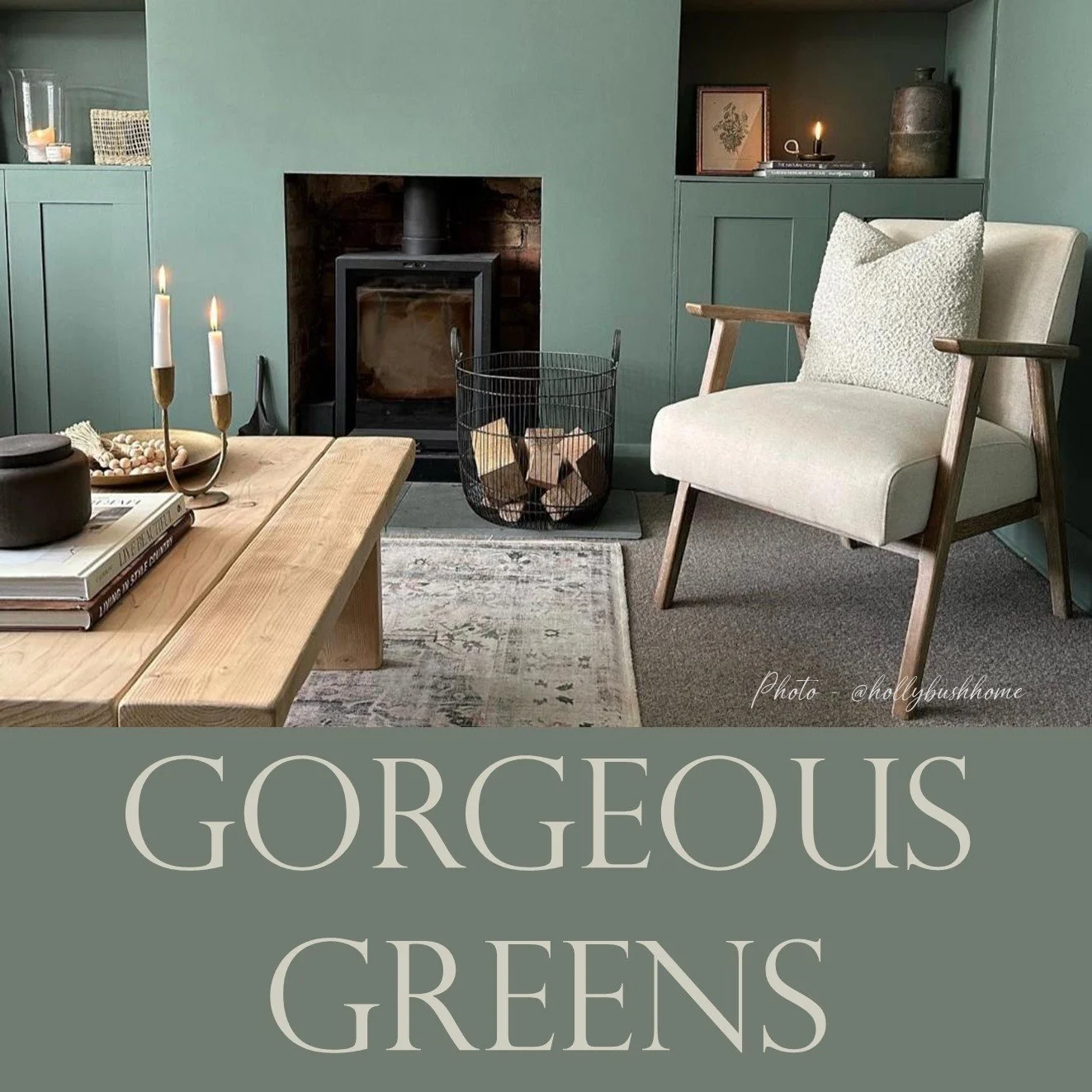
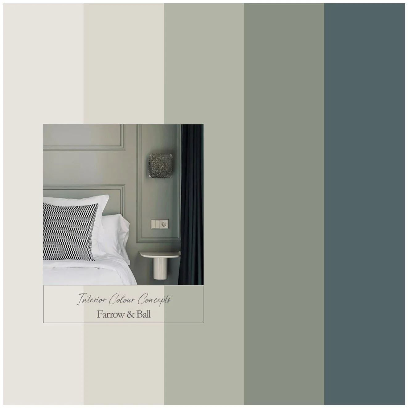
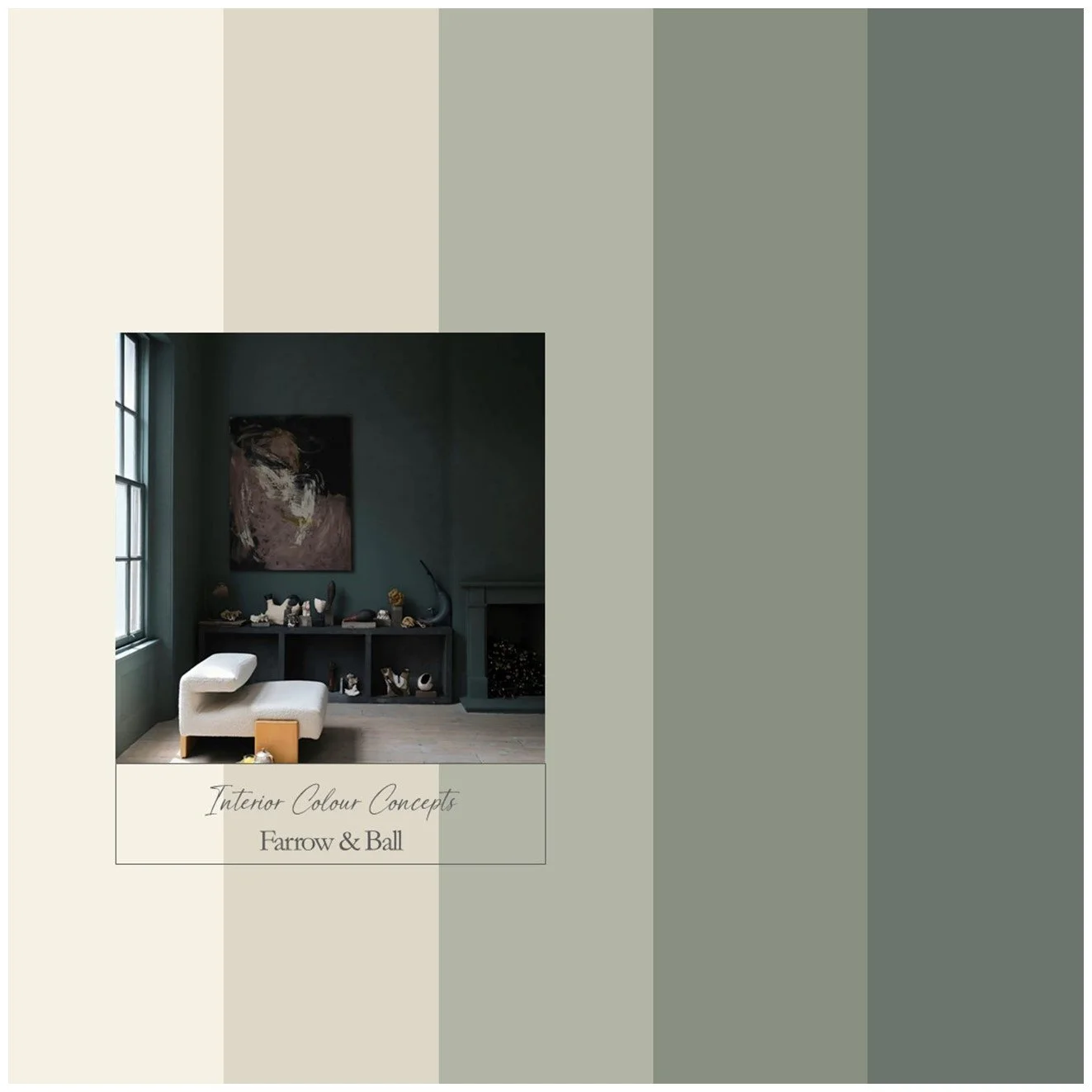
Gorgeous Greens
Green helps us find balance, grounding in nature and to achieve harmony. We have a wide range of green tones to help you find the perfect palette for your home. Some are muted, others are bold, but they are all enduring favourites. Refresh and revive your home with green.
-
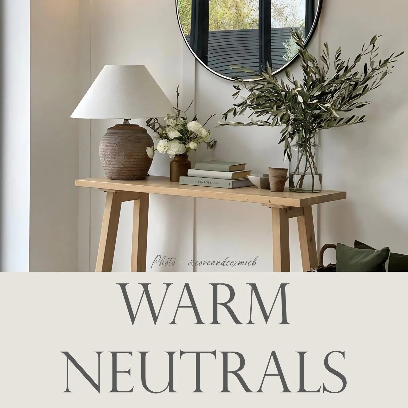
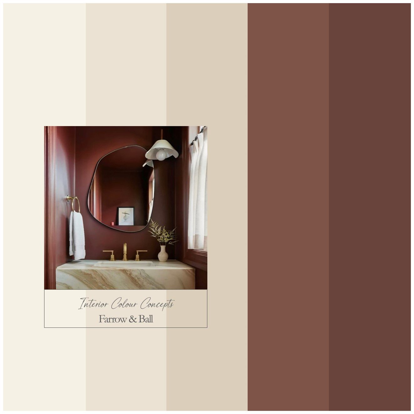
Warm Neutrals
Warm neutrals without cooler undertones are very popular at the moment. If you're looking for a monochrome scheme or the perfect neutral, take a look at these palettes for inspiration. I have included some darker accents as an option to create contrast and ground the look.
-
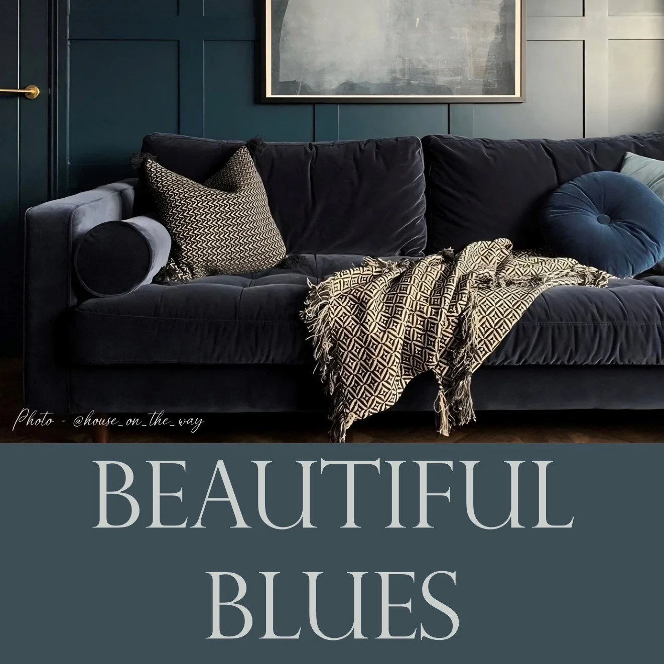
Beautiful Blues
Blue is one of the most popular colours used in interior design, and it’s easy to see why. Blues can evoke feelings of calm, stability and peace. They are also highly versatile. Take a look at our favourite blue colour schemes and see if their serenity has an effect on you.
-
Home Colour
These detailed guides help to ensure continuity and flow within your home, particularly with neutral paint colours. You will receive information on all nine colours within the scheme, along with four suggestions for combinations that could work in specific rooms, as well as explanatory notes.
-
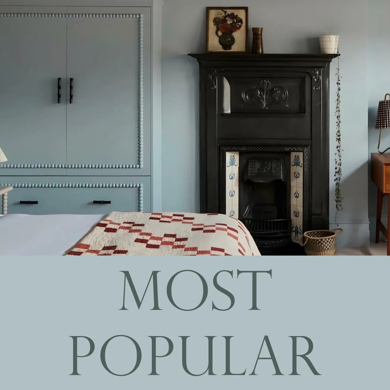
Most Popular
This is where we showcase some of the most popular colour palettes we offer. We have a variety of colour combinations, including blues, greens, pinks, and bold reds. Many of these designs are suitable for both modern and traditional settings, making them highly versatile.
-
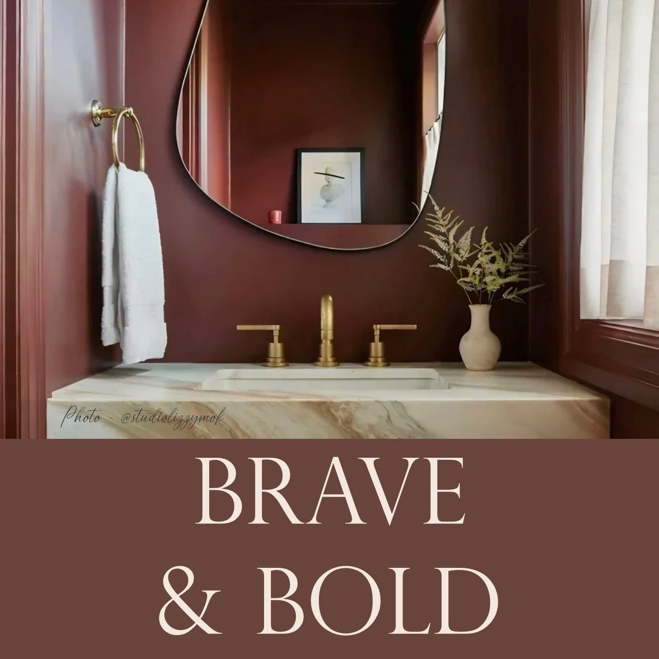
Brave & Bold
Bold, dynamic colours evoke emotion; they energise and excite our senses. If you are wary of adding bold tones use them in smaller quantities. Here, we present the most eye-catching and vibrant colour schemes, to help you reflect your personality in the decoration of your home.
-
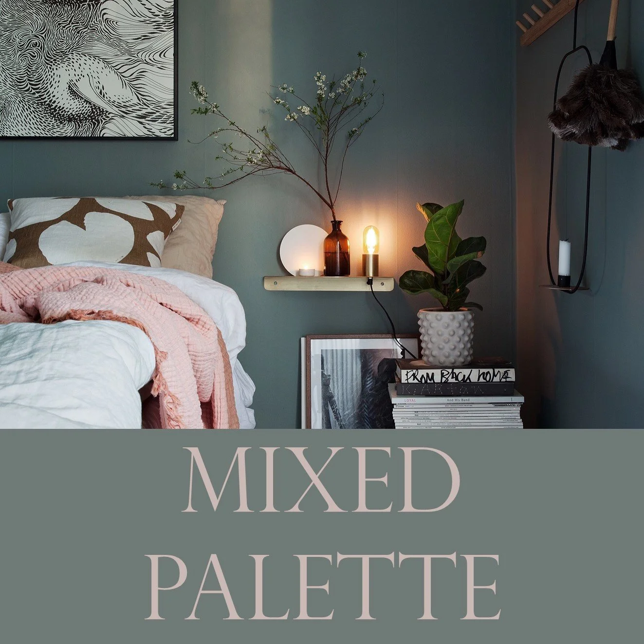
Mixed Palette
If you would like to use several colours within a room but are unsure of which tones will work together, our palettes with a mix of colours, and matching neutrals, are very helpful. All of our designs can be used for a specific room, an open-plan area or an entire floor/house.
-
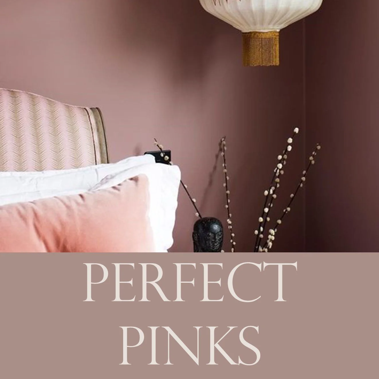
Perfect Pinks
Pink is generally associated with feelings of nurturing and love. Lighter shades are considered soothing and comforting, whereas brighter pinks can be stimulating and energetic. Take a look at this eclectic mix of palettes, ranging from muted tones to dramatic statements.
