 Image 1 of 5
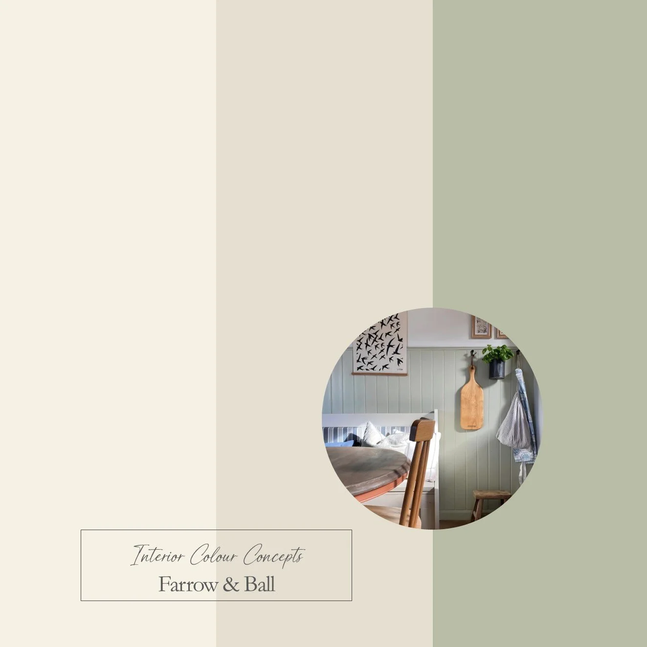 Image 2 of 5
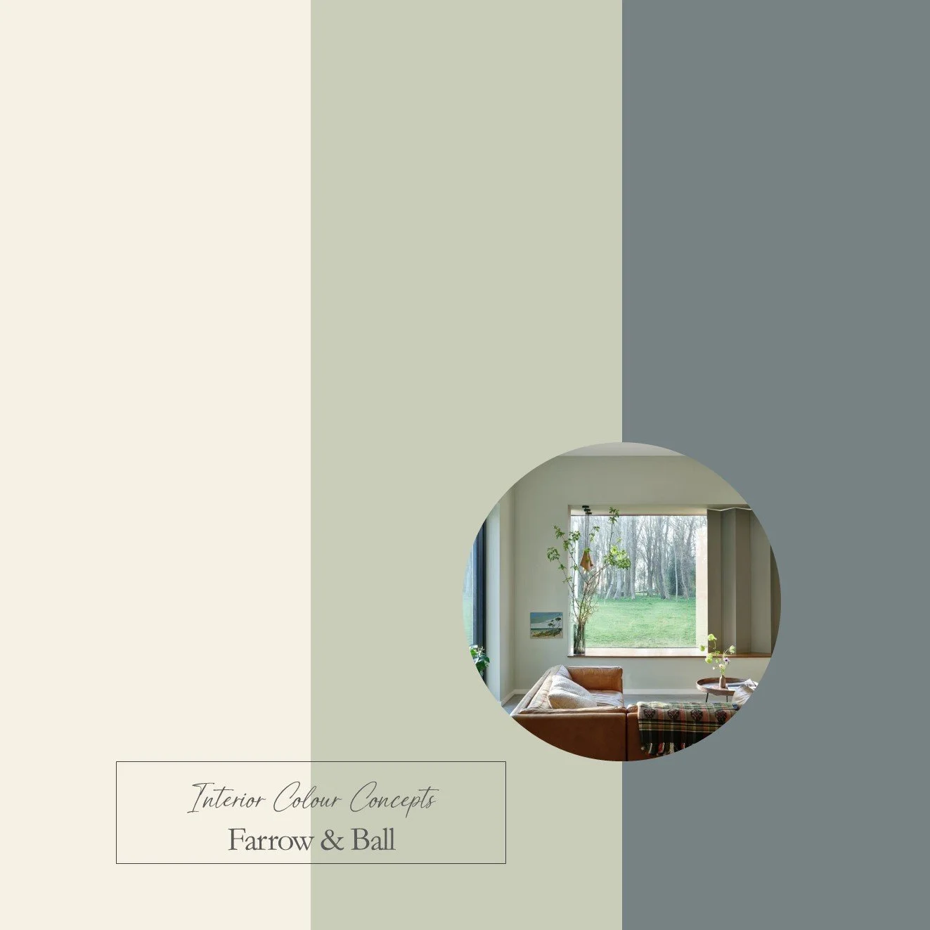 Image 3 of 5
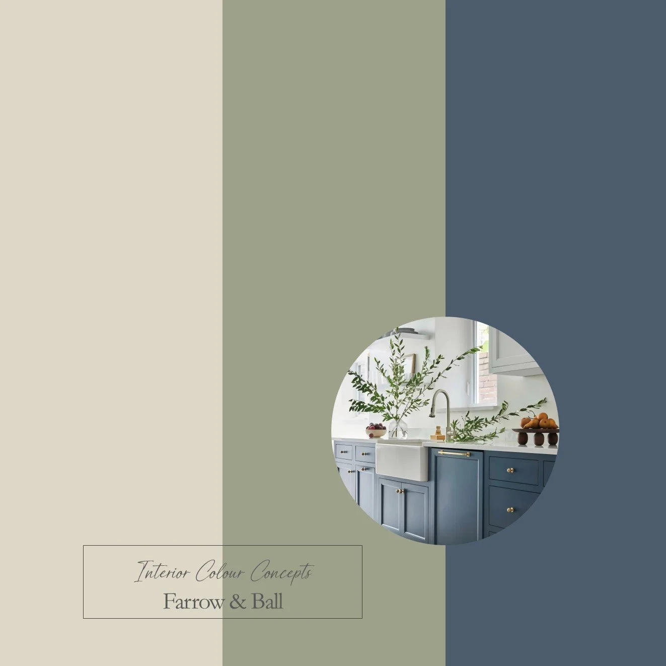 Image 4 of 5
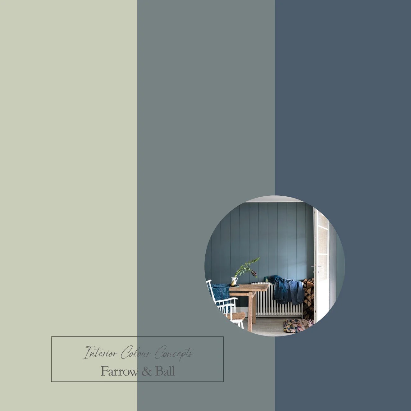 Image 5 of 5
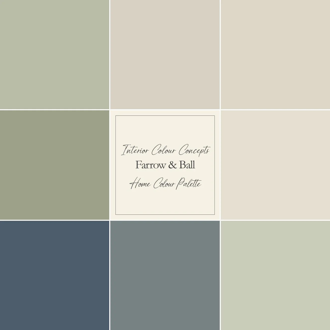
In this section, you can purchase a colour palette to be used throughout your home, in various rooms. This detailed guide helps to ensure continuity and flow, particularly with neutral paint colours. You will receive information on all nine colours recommended in the scheme, along with four suggestions for combinations that could work in specific rooms, as well as explanatory notes.
This colour scheme is similar to our number 3 board, using the same neutrals but with less muted greens and blues for a slightly brighter, more vibrant look. Spaces that promote stability and harmony can be created using blues and greens – that is why these combinations work so well in a home environment. These colour palettes can help you create a sense of balance and cohesion in your home. Images from @oakdesignproject, @the_indigo_house and @farrowandball.
Our advice is to always check your colour choice first on your Farrow & Ball or Little Greene colour card and then with a sample pot. Colours can look different depending on the aspect of your room and the lighting. Paint your sample onto a large piece of card or the back of a piece of wallpaper. Apply one coat, leave it to dry, then apply another to achieve an accurate representation of the colour. Move your painted paper sample around the room and tack it to different walls. Look at the colour in different lighting conditions and at different times of the day.
We kindly ask that you do not share any details of the colours on social media. We are a small company and would prefer to keep our colour boards within our domain whilst sharing them with you.