Living Room Paint Colour Ideas to Refresh your Home
Warm, contemporary, and effortlessly sophisticated: explore our inspirational guide to paint colours that can elevate your living room into a stylish, welcoming space full of character. Clicking the 'Shop' button will direct you to an extended five-colour palette, including the colours featured here, for further options.
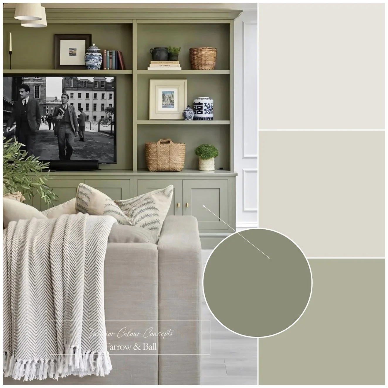
Relaxed Greens
This relaxed colour palette of Farrow & Ball greens is sophisticated yet laid-back, and above all, versatile. The scheme is flexible enough to work with many different interior styles in both modern and traditional settings.
We have two timeless greens: the lighter shade creates a calm, natural scene, adding warmth and character. The darker shade is richer and has more depth, especially when used as an accent, bringing a quiet elegance to any space.
If you choose not to use the darker green, I would recommend using the lighter green on your walls and either neutral on your doors and woodwork. Alternatively, use the darker green on bookshelves, media cabinetry or storage, and again either neutral shade for walls and woodwork. Image by @claire.totman.designs
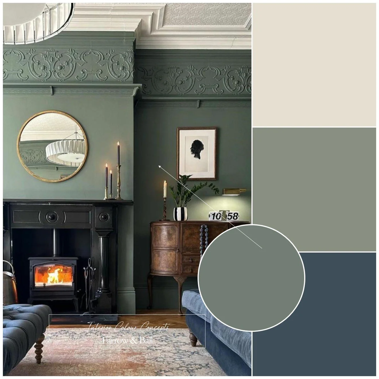
Moody Greens
The dark, moody green shown in the image is one of Farrow & Ball’s most popular paint colours. This deep, smoky green with strong blue undertones creates a sophisticated and cocooning atmosphere with a slightly dramatic touch.
I’ve paired it with a lighter green of a similar tone, warm stony neutrals, and a dark blue accent. This blue accent colour could be incorporated into soft furnishings, as seen in the image, where the blue velvet sofa perfectly balances out the green. Alternatively, you could use the lighter green as your main wall colour and then add this timeless neutral for ceilings and woodwork.
A room like this often comes into its own in the evening, when the warm lamplight and comfy seating create an elegant and luxurious atmosphere. Furthermore, this shade of green can make a large room feel more intimate by visually drawing the walls inwards slightly. Image by @beetrootandblack
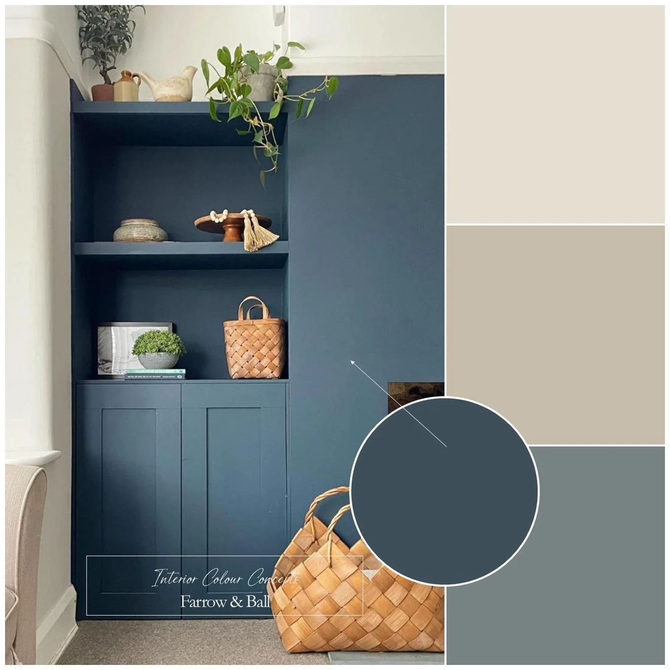
Refined Blues
This Farrow & Ball palette of blues and warm neutrals allows all the colours to play their part in a living room scheme. The two shades of blue add depth and character, while the neutrals bring softness and warmth. The contrast is noticeable yet gentle, giving the room an elegant feel rather than a stark one.
In this image, the darker blue is colour-drenched across one wall, its shelving, and its cabinets: this provides a focal point as you walk in. The rest of the room has the darker neutral painted on the wall space below the picture rail, with the lighter colour above. It is an excellent way to introduce colour to a room without overwhelming it. Alternatively, you could use the lighter of the two blues as your accent colour.
This is a colour palette with a lot of appeal as it creates a modern timeless look, offering balance and versatility in many different settings. Image by @hollybushhome.
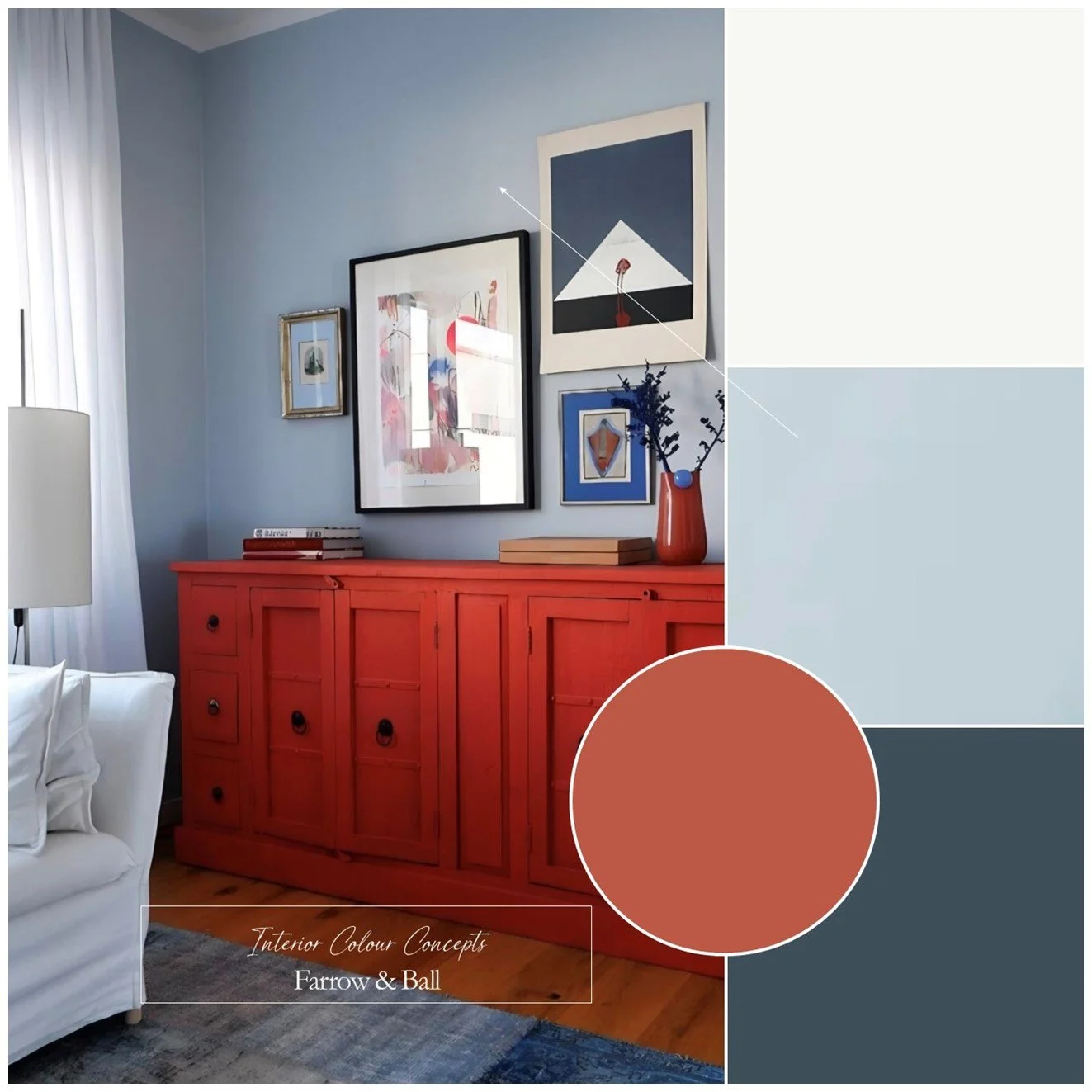
Nordic Blues
This Nordic-inspired interior colour scheme, created using Farrow & Ball paints, brings a sense of serenity and grounding to a space, balancing the lightness of Scandinavian design with depth and character. The central mid-tone blue evokes the tranquil atmosphere of misty forests, coastal landscapes and winter light. When used on walls, it provides a fresh, timeless and understated backdrop.
This mid-tone blue shade is ideal for your main wall colour, complemented by crisp white on ceilings and woodwork. You could then use either the deep blue or brick red as accents within the room. The sideboard in the image has been cleverly painted in one of Farrow & Ball’s archive colours, Copenhagen Roof.
These accent colours provide dramatic contrast when used on cabinetry, built-in shelving, interior doors, window frames or a statement wall; where their rich tones add sophistication and weight. Image by @purbeck.stone.
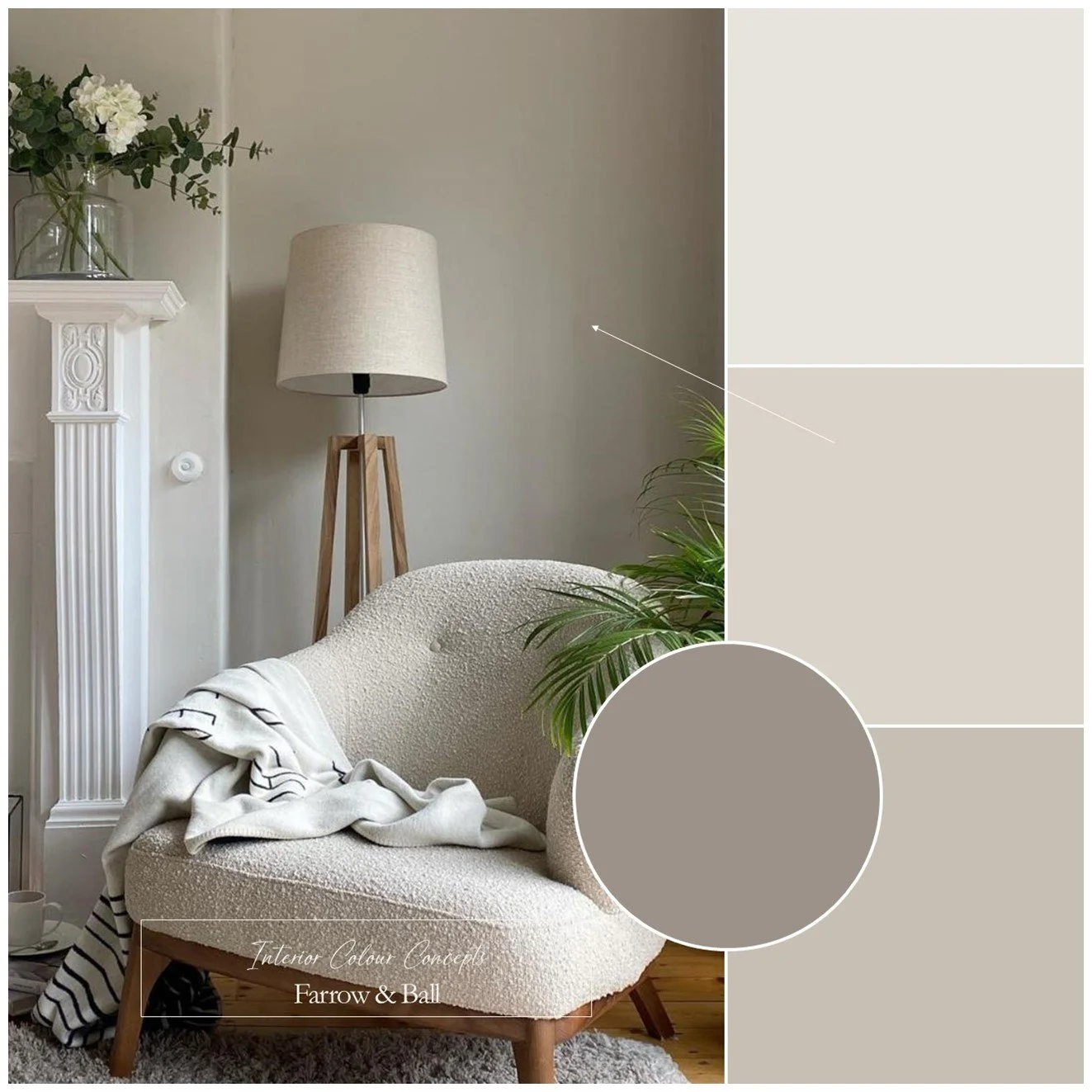
Warm Neutrals
This combination of warm, contemporary neutrals from Farrow & Ball creates a natural progression from light to dark. Taking a layered approach like this can make a living room feel more designed and cohesive than if you used a single shade throughout.
The lighter shades are warm grey-beiges that provide a calm, soft backdrop to a room. Then as you move through to the deeper tones in this palette, subtle mauve undertones begin to shine through.
You could use one of the lighter colours for the main walls, as shown in the image, and then use one of the darker colours for cabinets, a media unit or shelving. This will add visual interest, create contrast and the darker tones will add definition and sophistication. Image by @kath-cooke.
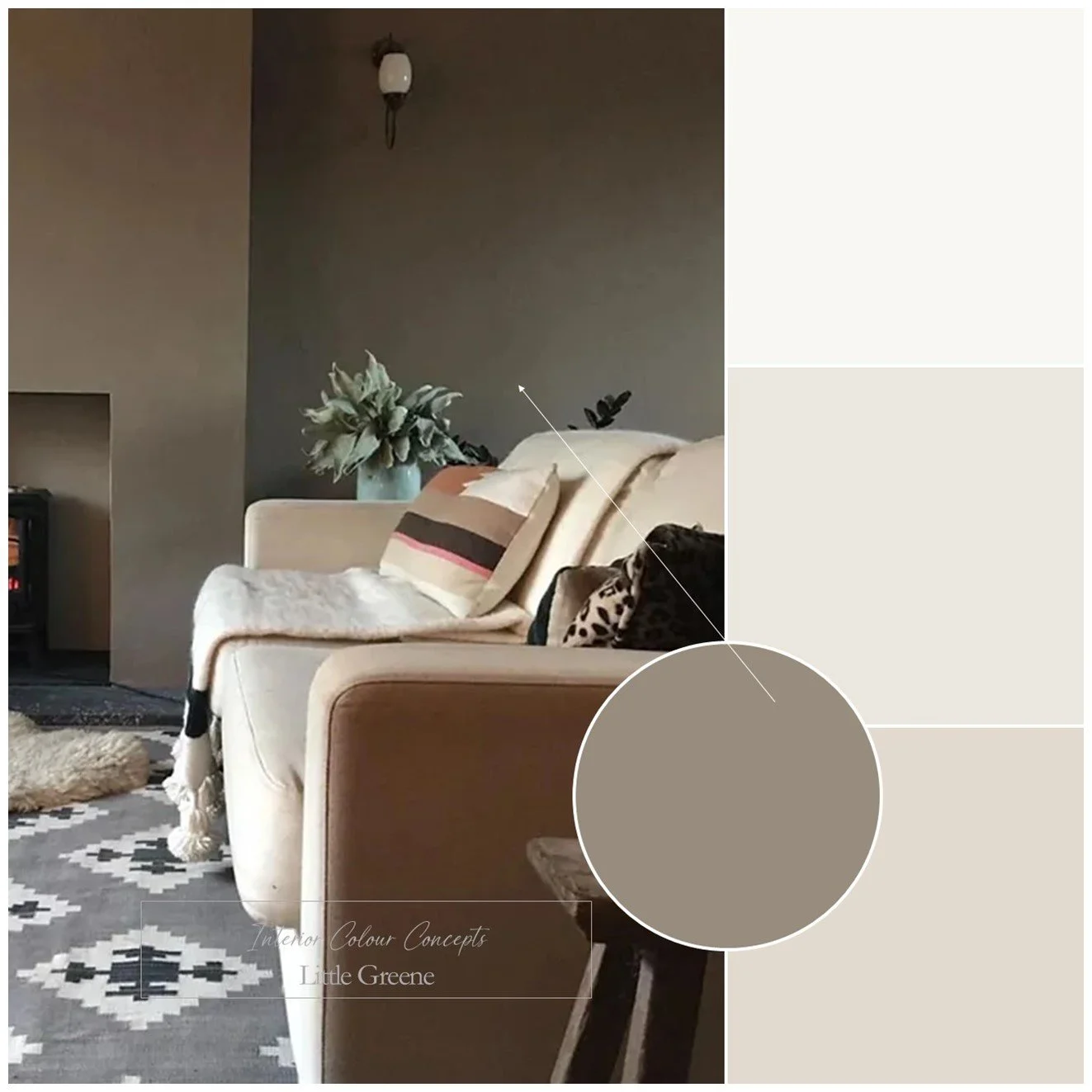
Earth Tones
The Little Greene Colour Scales collection was designed to allow related shades to be layered together harmoniously. The idea is to use subtle tonal shifts rather than obvious colour contrasts to create a calm and cohesive interior. That said, I created this palette using neutrals from the same colour scale, but added a different accent colour as it works perfectly within this scheme.
Historically used like an off-white, these beige-grey neutrals essentially bring a soft, welcoming feel to a room. The darker accent colour is a deeper, earthy, clay-toned neutral that will add depth and character to any living room.
You could use the darker shade on a feature wall, as shown in the image, or apply it more sparingly to painted furniture, woodwork, and cabinets. No matter which colour you choose as your main one, you can be sure that they are all designed to work together in a balanced way. Image by @sojojo.co.
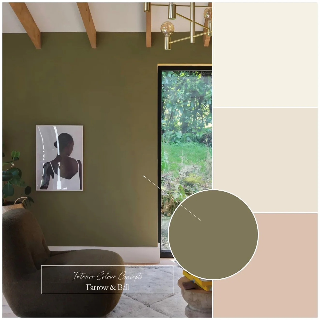
Modern Mix
How about this pairing of earthy, elegant Farrow & Ball paint colours for a modern interior look? The two main colours are a rich, olive green that exudes a natural, grounded character, and a soft, dusky pink with warm undertones. As the saying goes, opposites attract, and this is certainly true of this colour palette!
This is a highly versatile scheme: you can use either the green or the pink as the main colour for your walls, then add accents in the other colour. I’ve included warm, red-based neutrals, which work perfectly within the palette.
Add natural oak or walnut furniture for a mid-century modern feel. Then, to complete the look, layer in some soft furnishings with linen, bouclé and wool textures. Image by @farrowandball.
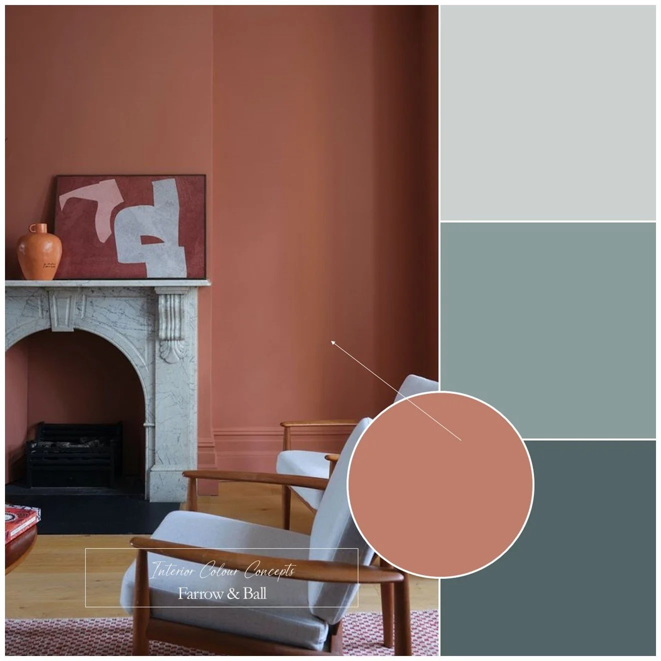
Colour Fusion
Lastly, I’ve chosen a blue and earthy red colour palette for the boldest inspiration in this living room section, featuring some of Farrow & Ball’s most popular paints. This scheme is a classic complementary one, where the colours are from opposite sides of the colour wheel. Furthermore, all the colours are muted rather than vivid so that they complement, rather than fight, against each other.
The two darker blues in this palette have green undertones, while the red is a warm, earthy terracotta that is rich without being overly bright. The contrast between the coolness and depth of the blues is balanced by the red's warm, grounding effect, creating a bold, exciting look.
You could use one of the blues as your main wall colour and use the red as an accent throughout the room. Alternatively, as shown in the image, you could use the red as your main wall colour and add touches of blue to balance it out and provide lovely contrast throughout your living room. Image by @farrowandball.