 Image 1 of 5
 Image 2 of 5
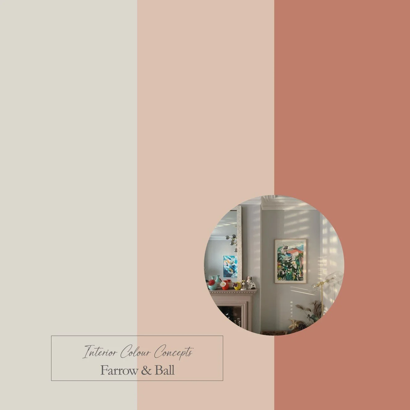 Image 3 of 5
 Image 4 of 5
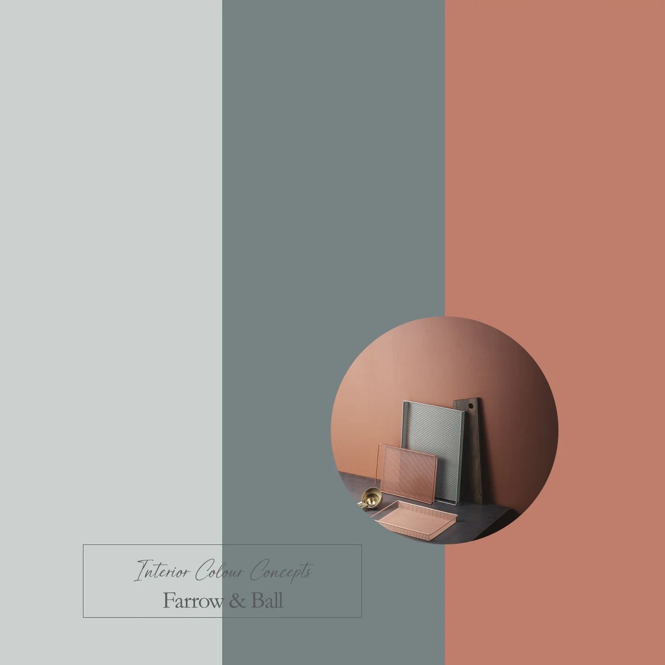 Image 5 of 5
Taking inspiration from nature, our carefully curated collection of ten paint colour schemes includes enduring favourites from Farrow & Ball and Little Greene. We aim to help you visualise colour pairings by displaying nine coordinating colours together in a palette. These colour boards will help you "zoom in" on the combinations you are naturally drawn to, and understand which paints work well together. They are an invaluable guide when making difficult colour choices for your home.
Our Earthy Reds Palette showcases bolder contrasts within the Farrow & Ball range of paints. The earthy reds are the stars of the show in this combination. You can opt for a more subtle look with the red and blush pink pairing in the top row, or you may prefer the stronger contrast of red and blue. Both options work well if you would like to create a warm, earthy feel. The middle row showcases the boldest combination of red and blue, while the bottom row offers a more laid-back group of tones that are perfect for a bedroom, home office or kitchen.
This is a digital product that will be sent to you as a PDF immediately after payment. The document will include 3 colour boards showing the names of all the paints featured in these palettes. The paint swatches should be viewed from left to right:
- Neutrals for walls, ceilings or woodwork
- A mid-tone colour for walls
- A darker accent colour for feature walls, painted furniture or soft furnishings