 Image 1 of 4
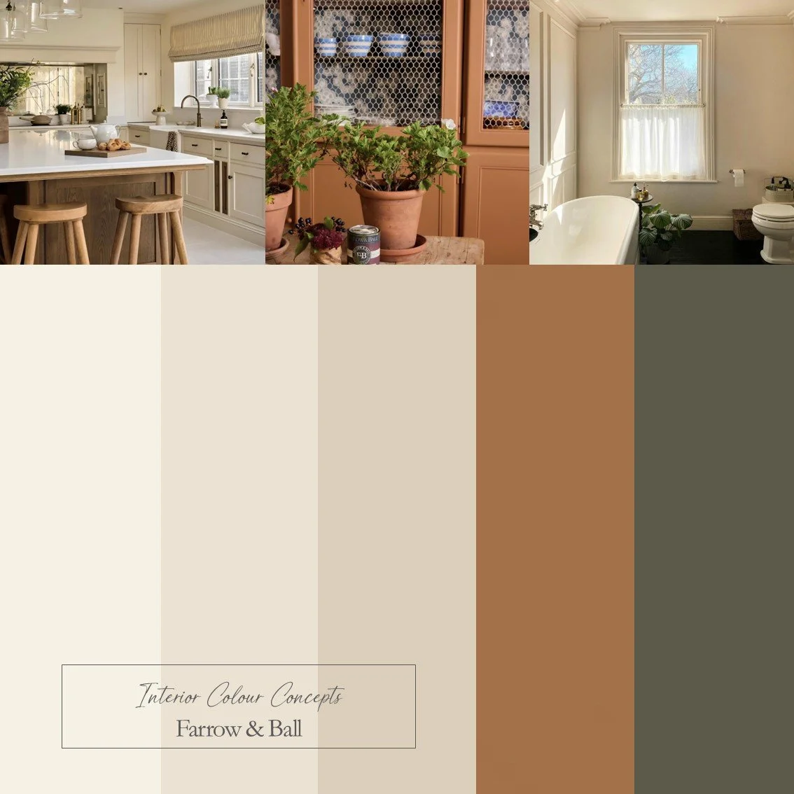 Image 2 of 4
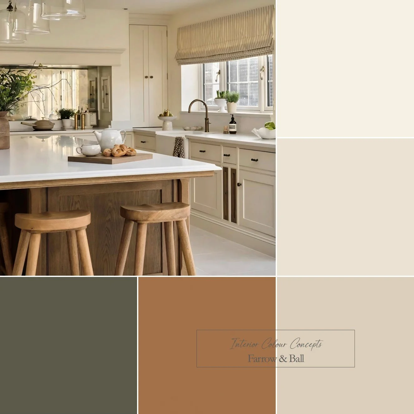 Image 3 of 4
 Image 4 of 4
Featuring a wonderful new colour from Farrow & Ball, the star of this Colour Board is an orange aptly named after a Portuguese word for preserves or marmalade. It is a spiced orange colour which is bold, but comforting. Paired with a green/brown and warm, red-based neutrals these tones would work perfectly in a kitchen with any of the neutrals on your walls, then add orange and/or green accents. Images from @rosywoodinteriors, @farrowandball and @the_flint_house.
Our advice is - always check your colour choice, firstly on your Farrow & Ball or Little Greene colour card, and then with a sample pot. Colours can look different, depending on the aspect of your room and various lighting situations. Paint your sample pot onto a large piece of card, or on the back of a wallpaper cut off. Paint one coat, let it dry, then paint another - you will then have a true representation of the colour. Move your paper paint sample around the room, tack it to different walls, look at the colour in different lighting conditions and at different times of the day.
We also kindly ask you not to share any details of the colours on Social Media - we are a small company and would like to keep our Colour Boards within our domain - whilst sharing them with you!