 Image 1 of 5
 Image 2 of 5
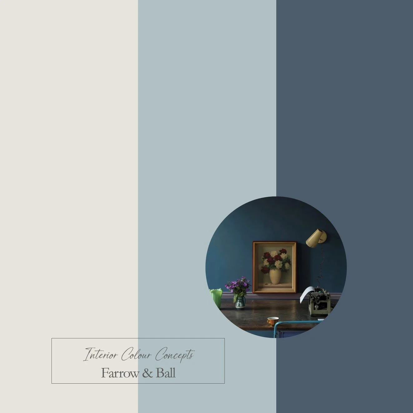 Image 3 of 5
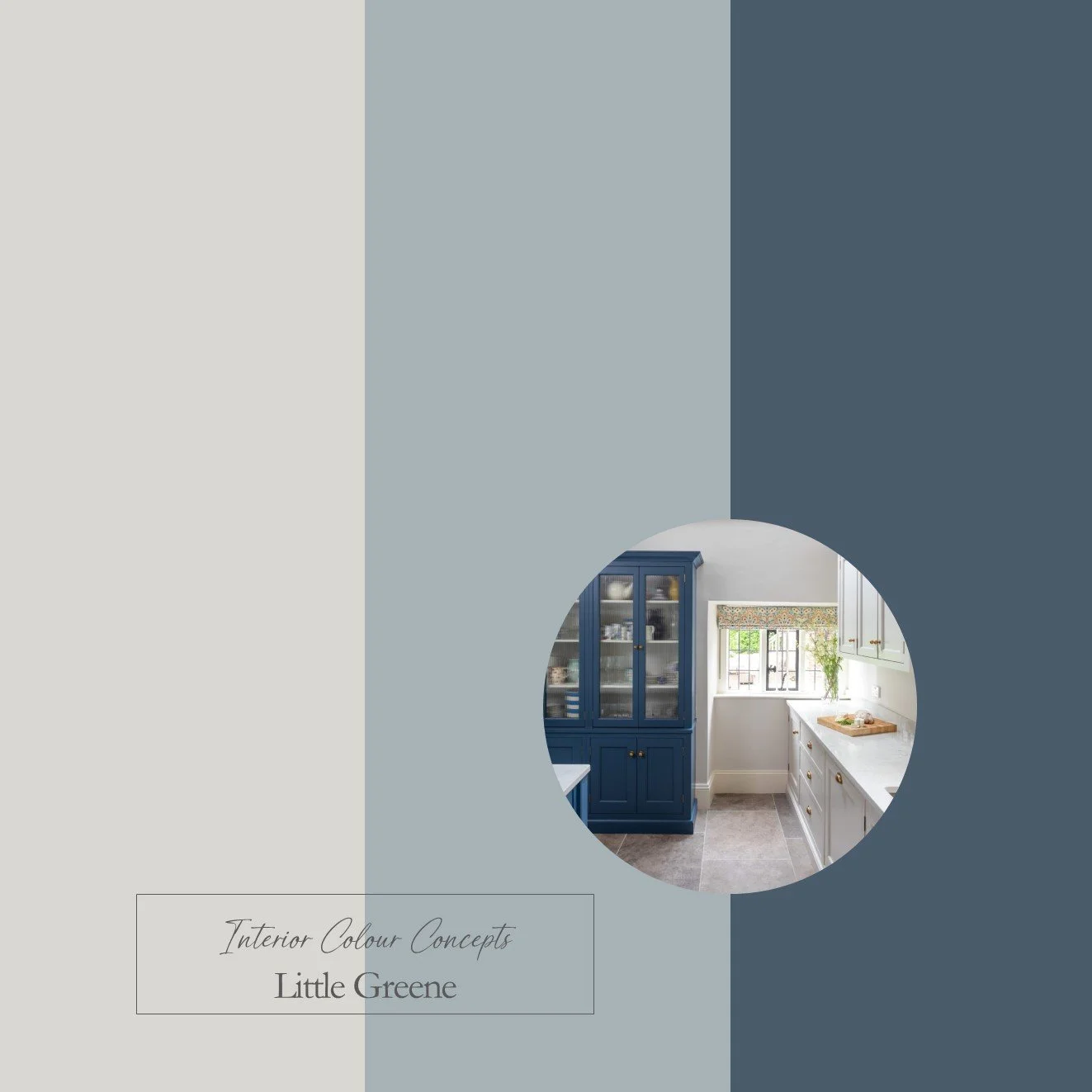 Image 4 of 5
 Image 5 of 5
Taking inspiration from nature, our carefully curated collection of ten paint colour schemes includes enduring favourites from Farrow & Ball and Little Greene. We aim to help you visualise colour pairings by displaying nine coordinating colours together in a palette. These colour boards will help you "zoom in" on the combinations you are naturally drawn to, and understand which paints work well together. They are an invaluable guide when making difficult colour choices for your home.
Our Timeless Blue Palette features classic combinations of dark blue, medium grey-blue and a light neutral shade. Blues are a popular colour in interior design as they create feelings of stability and reliability. Exposure to blue tones has been proven to lower pulse rates, as they radiate warmth and harmony. This colour palette would work well in bedrooms, living rooms and kitchens, where darker shades of blue could be used to accentuate islands and cabinets.
This is a digital product that will be sent to you as a PDF immediately after payment. The document will include 3 colour boards showing the names of all the paints featured in these palettes. The paint swatches should be viewed from left to right:
- Neutrals for walls, ceilings or woodwork
- A mid-tone colour for walls
- A darker accent colour for feature walls, painted furniture or soft furnishings