Complete Home Colour
A comprehensive range of colour palettes for use throughout your home.
Framework designed to give your home a cohesive look, bringing rooms together to create a balanced interior.
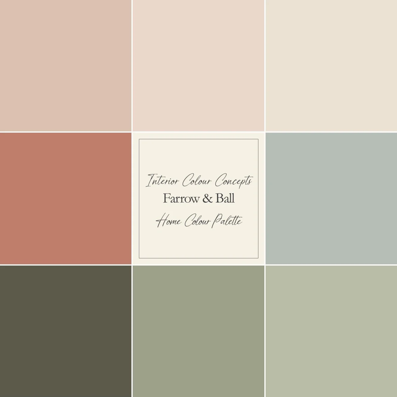
A soft blend of complementary Farrow & Ball colours.
If you like colour in your home, but prefer a more subtle palette, use the neutral colours in this guide throughout your home and add the suggested accents to create a space that is both energising and comforting. The greens and blue, combined with the two neutrals, provide a stable foundation for your colour scheme - then, add the pink accents as you prefer.
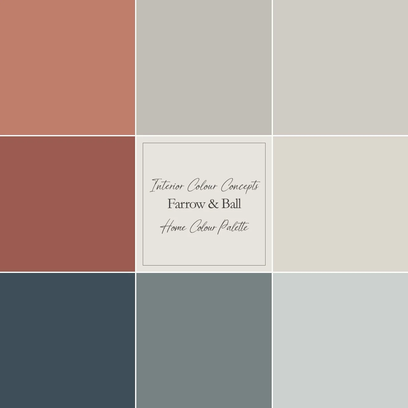
Bold reds and timeless blue paired with warm neutrals from Farrow & Ball.
Thanks to the balanced nature of the colours, this collection of classic blues and rich reds, together with complementary warm neutrals, would suit both traditional and modern settings. You could emphasise the blues throughout your home, using the reds as accents in smaller amounts. Alternatively, you could use the reds as bold statements to create warmth and depth.
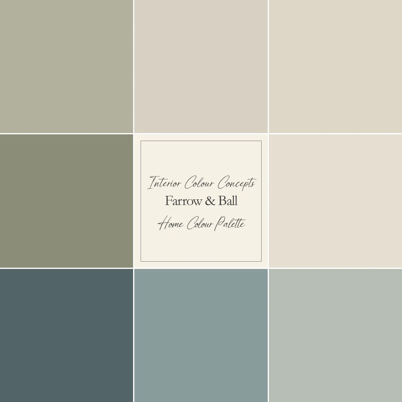
A balanced combination of blue and green tones from Farrow & Ball.
This Farrow & Ball collection of blues and greens, together with complementary neutrals, is ideal for creating a cohesive look throughout your home. The range of four harmonious neutrals can be used as a base in all your rooms, providing a coordinated backdrop to the other colours. This relaxed colour scheme is perfect for creating restful spaces that promote stability and harmony.
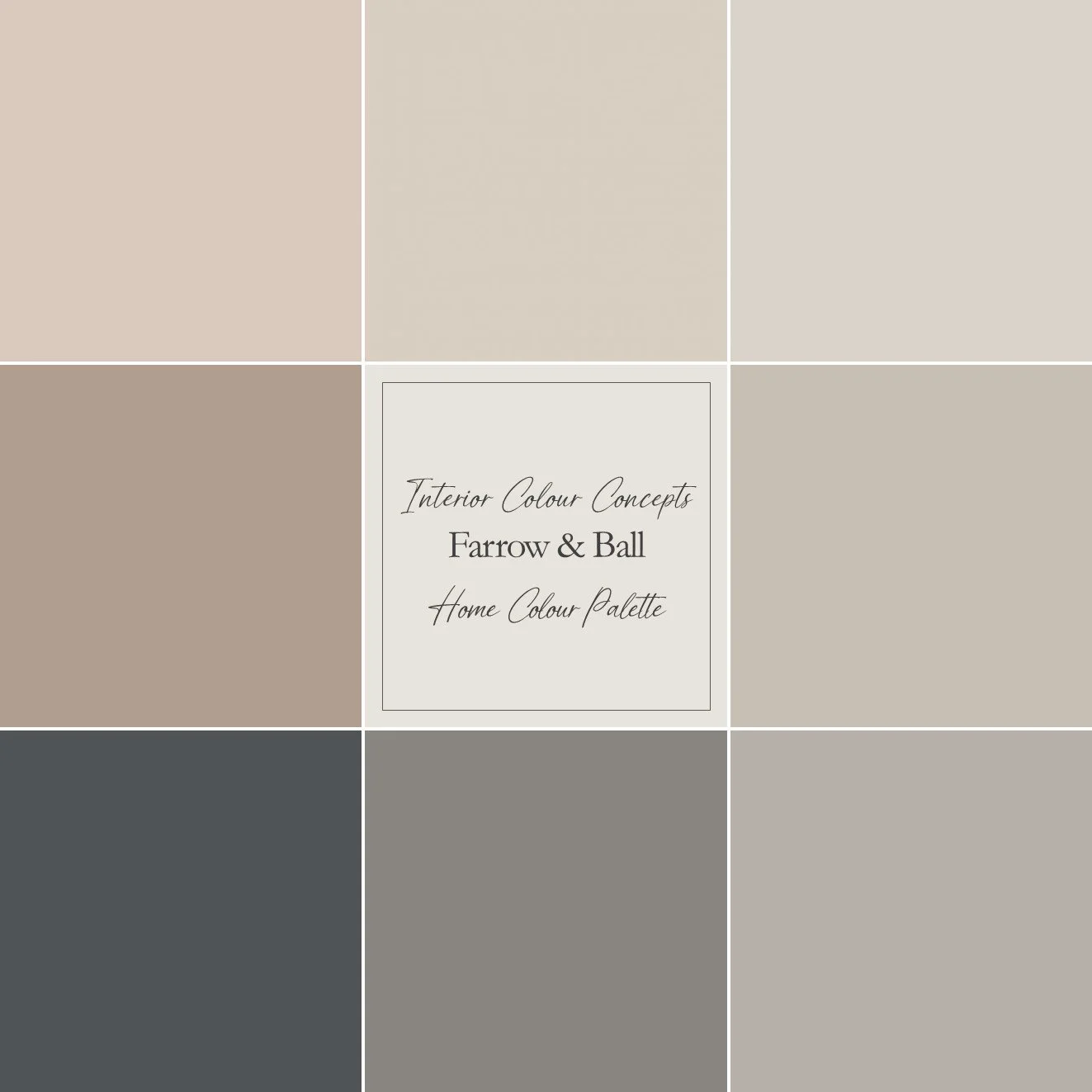
A warm, neutral palette of complementary Farrow & Ball shades.
This palette features a contemporary and sophisticated range of nuanced colours. Some have subtle grey-lilac undertones, giving them an unmatched warmth. Take a look at my suggestions on how you can incorporate these colours into your home while maintaining an interesting colour scheme with depth. This is an important consideration when using a neutral palette.
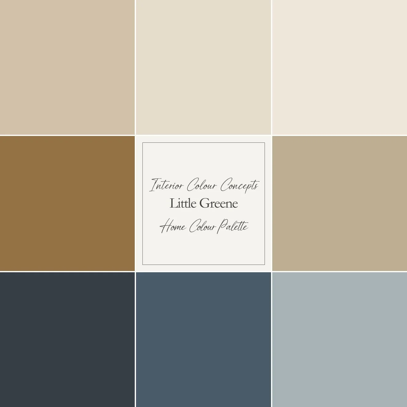
A harmonious blend of neutral tones and Little Greene blues.
This collection of classic blues and warm, earthy neutrals from Little Greene would suit a home where you are looking for caramel tones and blue accents. The three blues I have selected prevent the neutrals from overwhelming your colour scheme, cutting through the warm tones and providing maximum contrast. The blues add variety and provide a stable base for the look.