 Image 1 of 4
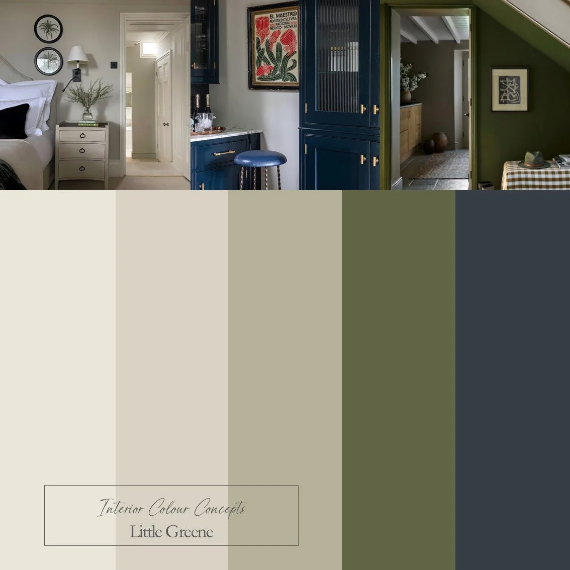 Image 2 of 4
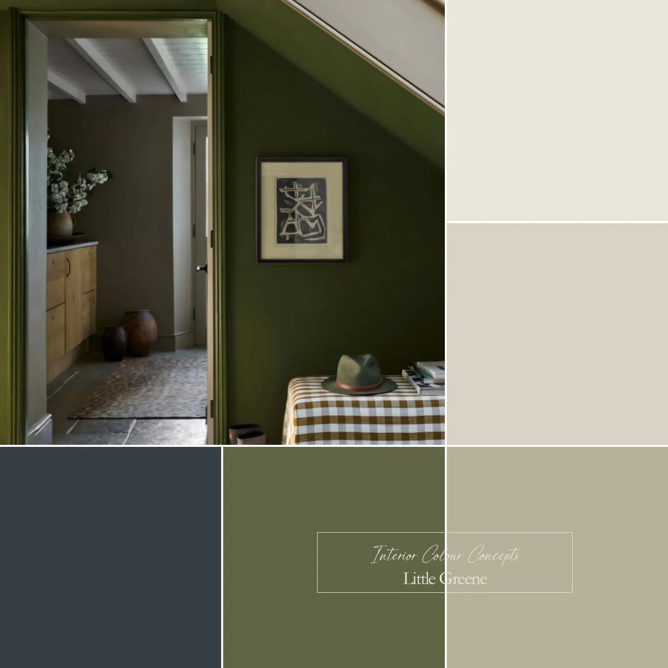 Image 3 of 4
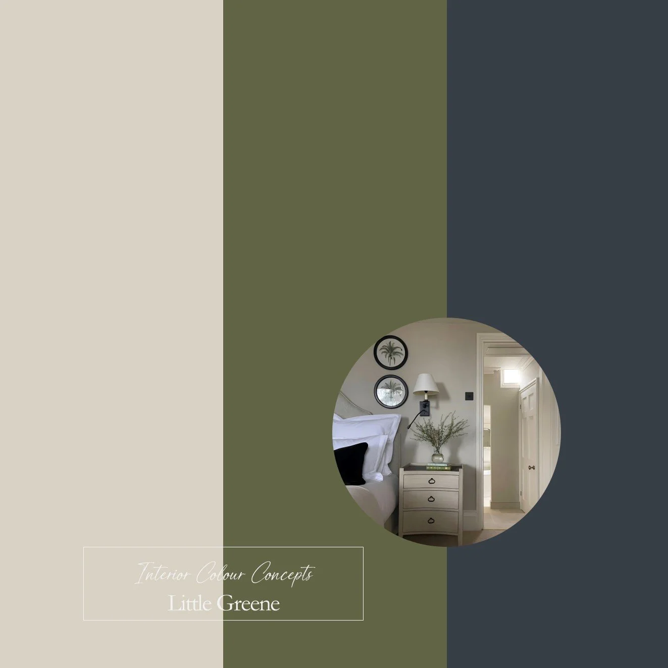 Image 4 of 4
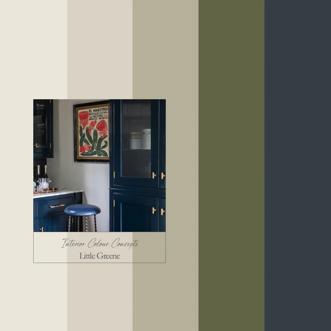
This is a bold and vibrant colour palette featuring classic dark blue and olive green shades from Little Greene Paints. I’ve paired these strong tones with a timeless mid-tone green and warm, stony neutrals to create a balanced scheme. This palette would work well in a hallway, for example, where you could paint the staircase woodwork dark blue, the walls a neutral colour, and use the olive green as an accent. Alternatively, you could paint your lower kitchen units and island in blue and/or olive green, and use the lighter green or neutrals for the upper units and walls. Images by @elizabethstanhope and @littlegreenpaints.
Our advice is - always check your colour choice, firstly on your Farrow & Ball or Little Greene colour card, and then with a sample pot. Colours can look different, depending on the aspect of your room and various lighting situations. Paint your sample pot onto a large piece of card, or on the back of a wallpaper cut off. Paint one coat, let it dry, then paint another - you will then have a true representation of the colour. Move your paper paint sample around the room, tack it to different walls, look at the colour in different lighting conditions and at different times of the day.
We also kindly ask you not to share any details of the colours on Social Media - we are a small company and would like to keep our Colour Boards within our domain - whilst sharing them with you!
This is a bold and vibrant colour palette featuring classic dark blue and olive green shades from Little Greene Paints. I’ve paired these strong tones with a timeless mid-tone green and warm, stony neutrals to create a balanced scheme. This palette would work well in a hallway, for example, where you could paint the staircase woodwork dark blue, the walls a neutral colour, and use the olive green as an accent. Alternatively, you could paint your lower kitchen units and island in blue and/or olive green, and use the lighter green or neutrals for the upper units and walls. Images by @elizabethstanhope and @littlegreenpaints.
Our advice is - always check your colour choice, firstly on your Farrow & Ball or Little Greene colour card, and then with a sample pot. Colours can look different, depending on the aspect of your room and various lighting situations. Paint your sample pot onto a large piece of card, or on the back of a wallpaper cut off. Paint one coat, let it dry, then paint another - you will then have a true representation of the colour. Move your paper paint sample around the room, tack it to different walls, look at the colour in different lighting conditions and at different times of the day.
We also kindly ask you not to share any details of the colours on Social Media - we are a small company and would like to keep our Colour Boards within our domain - whilst sharing them with you!