 Image 1 of 5
 Image 2 of 5
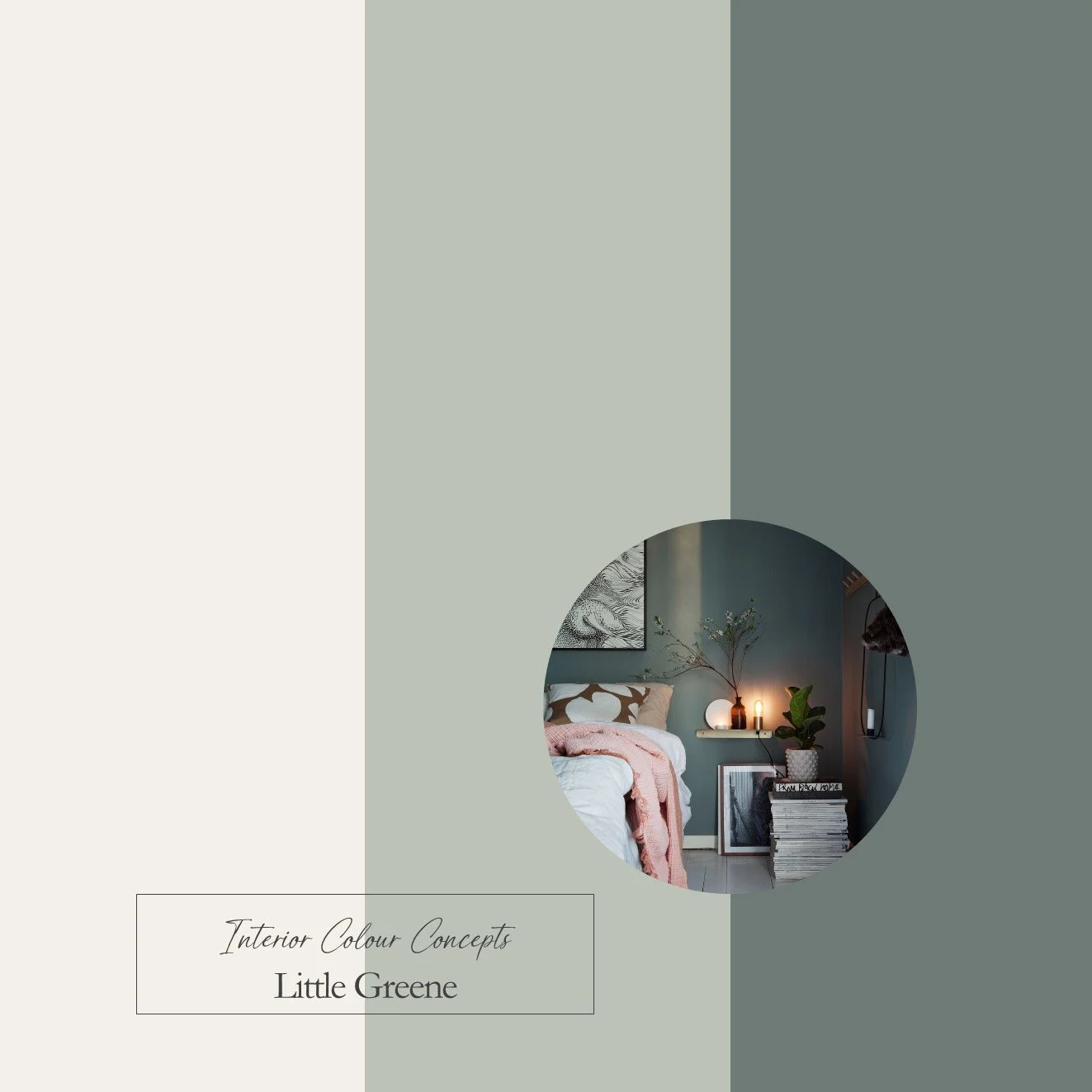 Image 3 of 5
 Image 4 of 5
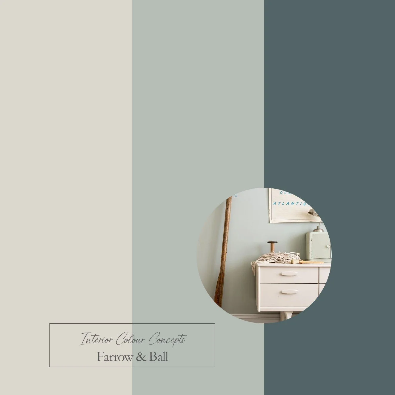 Image 5 of 5
Taking inspiration from nature, our carefully curated collection of ten paint colour schemes includes enduring favourites from Farrow & Ball and Little Greene. We aim to help you visualise colour pairings by displaying nine coordinating colours together in a palette. These colour boards will help you "zoom in" on the combinations you are naturally drawn to, and understand which paints work well together. They are an invaluable guide when making difficult colour choices for your home.
Our Blue Green Palette features shades of blue with green undertones and greens with blue undertones. These paint colours are calm, laid-back and serene. Inspired by nature, they will bring tranquillity to your living space when used in your home. They create a wonderfully soft and muted look with nuanced blue, grey and green tones that could be used in a bedroom, study, living room or kitchen, in both traditional and modern settings. The complementary neutrals are all warm and grey, which is perfect for woodwork and ceilings.
This is a digital product that will be sent to you as a PDF immediately after payment. The document will include 3 colour boards showing the names of all the paints featured in these palettes. The paint swatches should be viewed from left to right:
- Neutrals for walls, ceilings or woodwork
- A mid-tone colour for walls
- A darker accent colour for feature walls, painted furniture or soft furnishings