Farrow & Ball Nine New Colours
Farrow & Ball has introduced nine exceptional new colours for 2025. Here, we celebrate these new tones and provide inspirational colour schemes to help you visualise how they might look in your home. To see the full range, simply click on the 'Shop Now' button to take a closer look and purchase a PDF image containing all the colour names.

Kakelugn
This Farrow & Ball palette features a beautiful, soft new Scandi blue. Kakelugn is a clean, light blue, inspired by the decorative tiles found on traditional Swedish stoves. I created this pastel palette for use in a child's room, a restful bedroom, or a bathroom. The pinks add warmth and contrast, and complement Kakelugn perfectly alongside the paler blue and crisp white. Image from @farrowandball.

Douter
Drawing inspiration from the soot and tarnished brass of traditional candle snuffers, this fabulous new colour offers a fresh take on the classic Farrow & Ball shade, Inchyra Blue. It is a smoky grey-green bringing mood and drama to a space, while remaining versatile. In this colour scheme, I have used it as a dark accent alongside two lighter blue-green colours. It partners perfectly with a warm, stony grey neutral and classic off-white. Image from @farrowandball.

Naperon
Inspired by the humble kitchen apron, this beautiful new terracotta shade from Farrow & Ball is a wonderful addition to their range of red tones. Warm and rich yet relaxed and laid-back, this colour can be used to great effect in both modern and traditional settings. Here, I’ve paired it with another classic red, charcoal, and warm, stony neutrals. A wonderful way to introduce colour to your home. Image from @farrowandball.

Dibber
Dibber is an earthy green shade inspired by the gardening tool used for making holes. It is a lovely, soft mossy green with a 'knocked back' look, which gives it an entirely natural feel. It works well with many other colours, but I particularly like it in this almost monochrome scheme with a darker green-brown accent and grey-green neutrals. This is a timeless combination of colours that brings a relaxed sophistication to any space. Image from @farrowandball.

Scallop
Scallop is one of my favourite new colours from Farrow & Ball — it's a lovely neutral shade and a lighter interpretation of Dead Salmon. Taking inspiration from the soft colour and gently curved shape of the shellfish, Scallop could be used in many different settings. It is a warm, rosy beige which, as you can see, creates a relaxing, cosy space. I’ve paired it with other red-based neutrals, a darker pink and a green-brown accent. Image from @vincent_the_house.
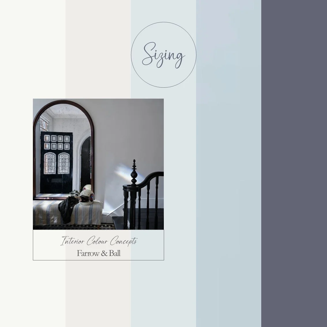
Sizing
Farrow & Ball have introduced this fresh, new neutral to their range with their usual expertise and knowledge of colour. With its distinctive cool blue undertones and crispness, Sizing works well alongside the other two mid-toned blues. If you're looking for a calm, relaxed colour scheme with Scandi influences, and a clean, contemporary feel, look no further. Pair any of these three beautiful shades of blue with a brilliant white and a darker, warmer blue as an accent colour. Image from @farrowandball.

Reduced Green
Reduced Green is a dark, bold accent and a remarkably versatile new addition to the Farrow & Ball range. This muddied green-brown shade works well with many different Farrow & Ball colours, including this classic mid-tone green. When paired with timeless stony-grey neutrals, you can decide how much green or neutral to incorporate into your space. Then, use the darker accent of Reduced Green on woodwork, furniture or a fireplace. Image from @farrowandball.

Marmelo
I love this bold new shade of orange from Farrow & Ball. Marmelo is an aptly named spiced orange colour inspired by the Portuguese word for preserves or marmalade. It is a wonderfully comforting colour, evoking an informal, cosy atmosphere. It works particularly well with darker green-brown accents, which balance out the strong orange. Use warm, red-based neutrals to create a beautiful colour scheme — perfect for a kitchen or hallway. Image from @farrowandball.

Duster
A fantastic new addition to the Farrow & Ball range, Duster is a deep ochre shade inspired by the humble yellow cloth. If you are looking for a yellow that is not so bright or saturated, this aged yellow with warmth and subtlety is the one for you. In this colour board, I have paired it with a lovely charcoal shade and warm, stony neutrals. The charcoal accent provides a grounding element and brings balance to the colour scheme. Image from @farrowandball.