 Image 1 of 5
 Image 2 of 5
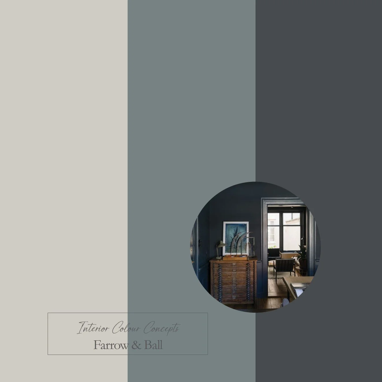 Image 3 of 5
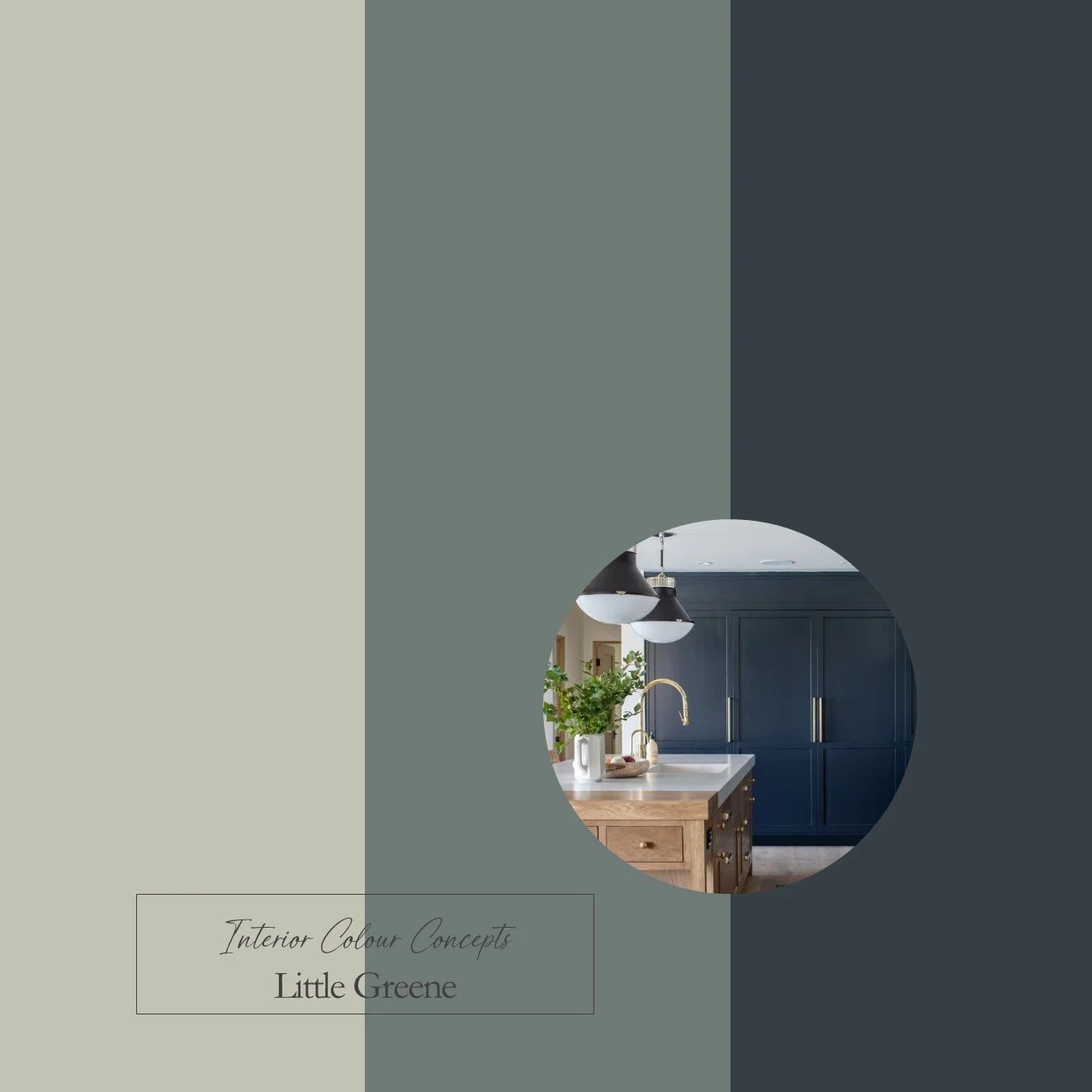 Image 4 of 5
 Image 5 of 5
Taking inspiration from nature, our carefully curated collection of ten paint colour schemes includes enduring favourites from Farrow & Ball and Little Greene. We aim to help you visualise colour pairings by displaying nine coordinating colours together in a palette. These colour boards will help you "zoom in" on the combinations you are naturally drawn to, and understand which paints work well together. They are an invaluable guide when making difficult colour choices for your home.
Our Dark Accents Palette showcases darker tones from Farrow & Ball and Little Greene. Using darker accents in your interior design can add drama, highlight architectural features, and create a sense of grounding. They can also provide a striking contrast to lighter neutrals or other colours within a palette. Don't be afraid to use darker tones in your home, as even the smallest accent can add character to a space. The column on the right features the darkest shades of black, dark green, and dark blue/black, while the middle column adds a punch of colour with three medium to dark shades. All the neutrals used here are slightly darker to balance the weight of the other colours.
This is a digital product that will be sent to you as a PDF immediately after payment. The document will include 3 colour boards showing the names of all the paints featured in these palettes. The paint swatches should be viewed from left to right:
- Neutrals for walls, ceilings or woodwork
- A mid-tone colour for walls
- A darker accent colour for feature walls, painted furniture or soft furnishings