

Farrow & Ball Colour Board
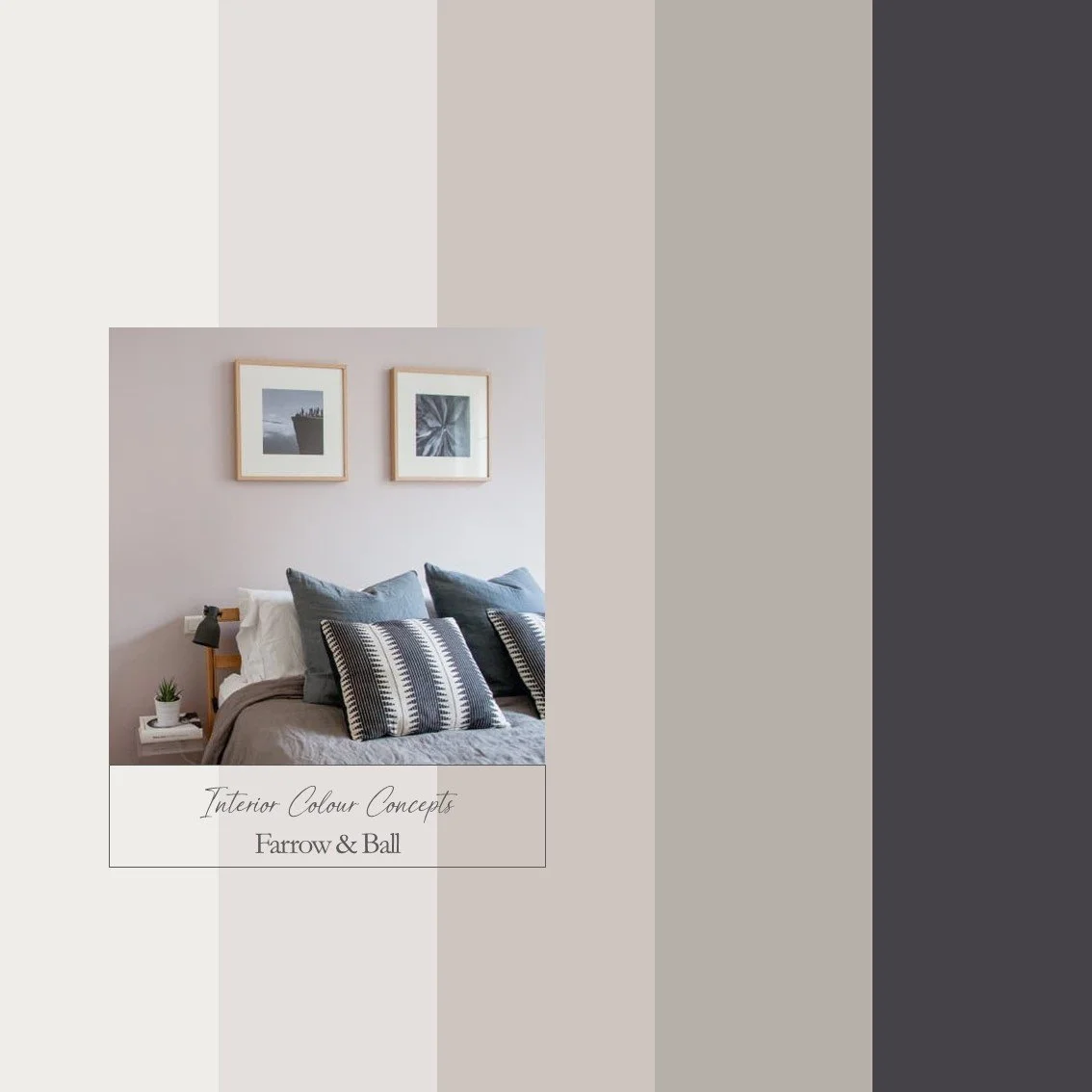
Pink can be considered another neutral option - particularly the lighter colours. These pinks are grown up, calming, with warm grey and lilac tones running through. Pair with a grey/white or darker purple/black accent for maximum contrast.
Our advice is - always check your colour choice, firstly on your Farrow & Ball or Little Greene colour card, and then with a sample pot. Colours can look different, depending on the aspect of your room and various lighting situations. Paint your sample pot onto a large piece of card, or on the back of a wallpaper cut off. Paint one coat, let it dry, then paint another - you will then have a true representation of the colour. Move your paper paint sample around the room, tack it to different walls, look at the colour in different lighting conditions and at different times of the day.
We also kindly ask you not to share any details of the colours on Social Media - we are a small company and would like to keep our Colour Boards within our domain - whilst sharing them with you!
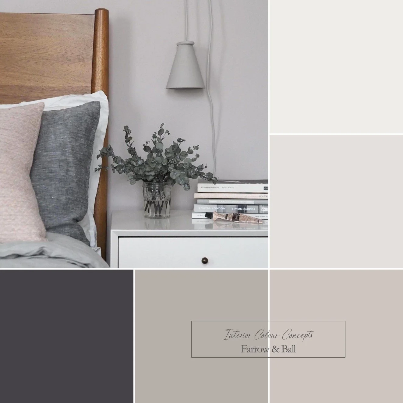